BMO Private Wealth's Digital Transformation
How a content-first redesign increased lead submissions by 96%…by putting clients at the centre of every word.
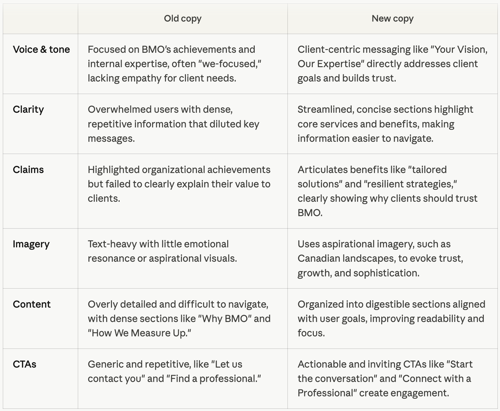
The Challenge
BMO Private Wealth's digital presence wasn't keeping pace with its clients. Across 44 pages spanning mobile and desktop, the content spoke about the organization…not to the people it served.
Working alongside UX designers, developers, and stakeholders across multiple lines of business, I led the content redesign to fix that.
The strategic foundation came from UX research conducted by Havas, which gave us a clear picture of what high-net-worth clients actually needed to feel seen, understood, and ready to act.
The Goal of the Redesign
The 44 pages involved in this redesign had a fundamental voice problem: it talked about BMO. It needed to talk about the client. My mandate was to pivot the entire content strategy…from a "we're great" tone to a "here's what we can do for you" one.
That meant rewriting for clarity, empathy, and trust, while making sure every page clearly answered:
Why BMO? Why now? Why does this matter to me?
What the research revealed: 4 gaps we had to close
External research by Havas, combined with internal user testing, surfaced the exact reasons why affluent clients weren't converting …and gave us a precise brief to work from.
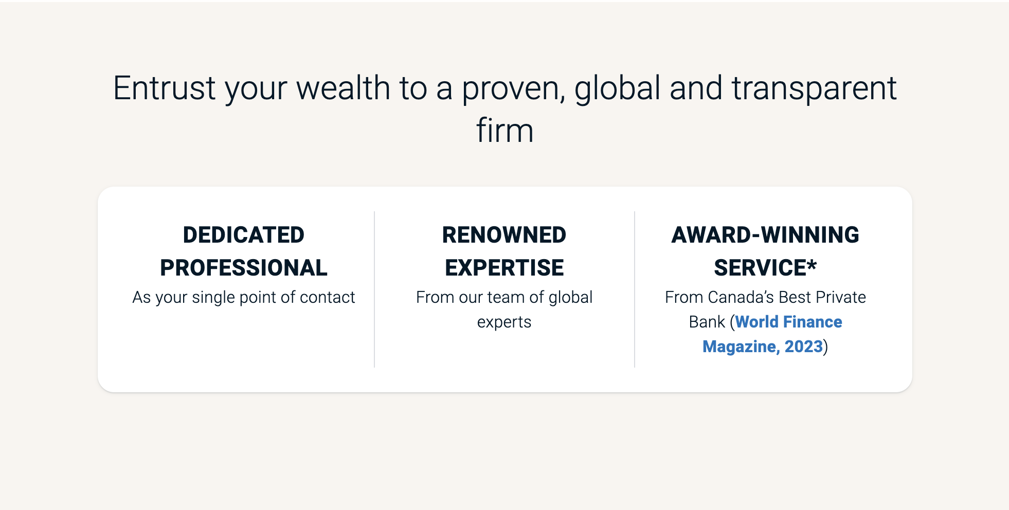
1. The site didn’t feel like it belogned to high-net-worth clients
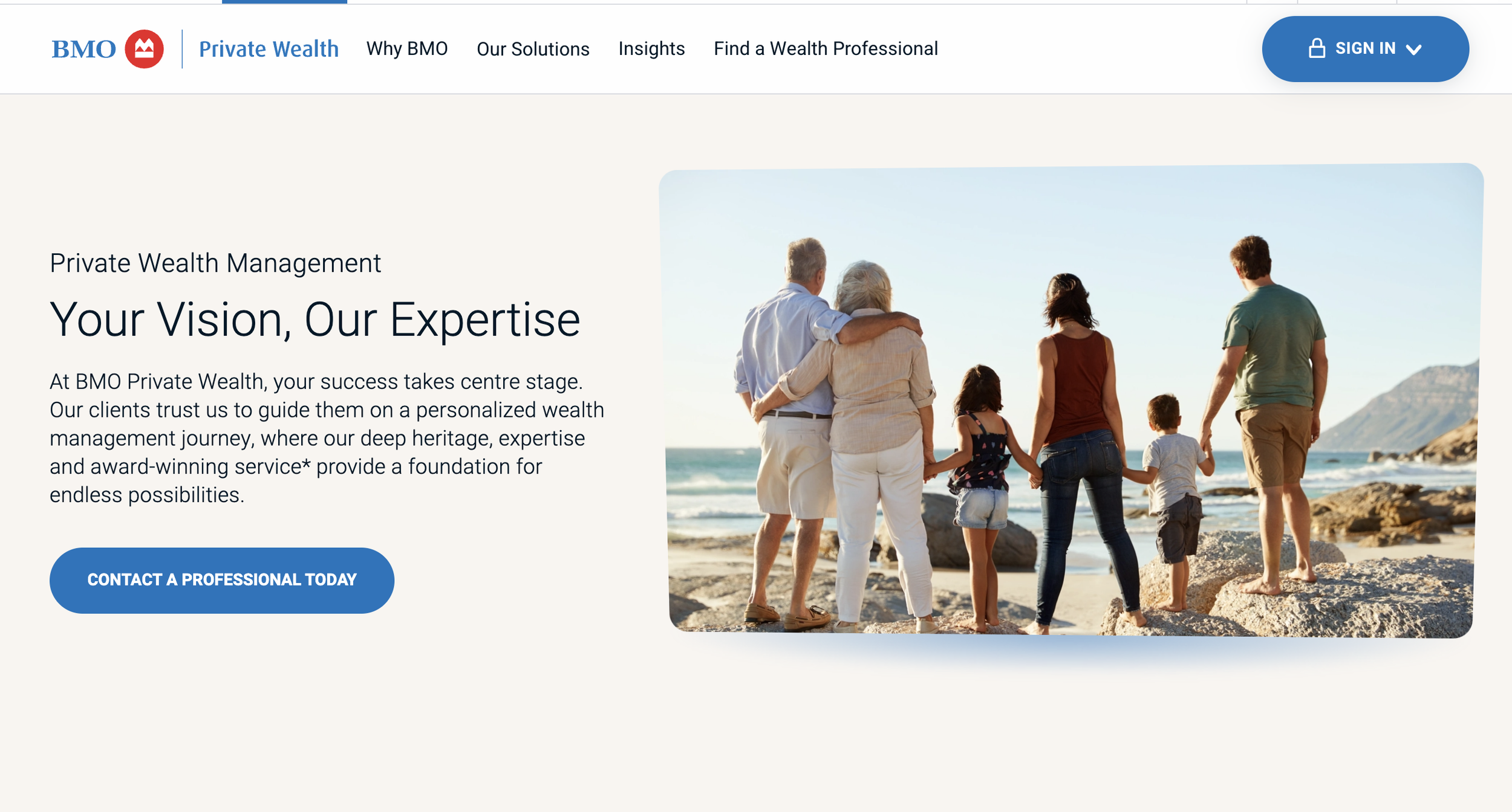
The homepage lacked the sophistication needed to resonate with affluent clients. High-net-worth individuals evaluating a wealth management partner aren't just assessing products — they're assessing whether they feel understood at first glance. The existing design felt generic; it could have belonged to any mid-tier financial brand. There was no signal that said "this space was built for you."
Research made clear that design and content both needed to evoke trust, elegance, and the quiet confidence affluent clients associate with premium service. This finding shaped every decision that followed — from headline tone to landscape imagery to the deliberate removal of dense, cluttered copy sections that undermined the premium feel.
3. "What we do needed to become "What you’ll get"
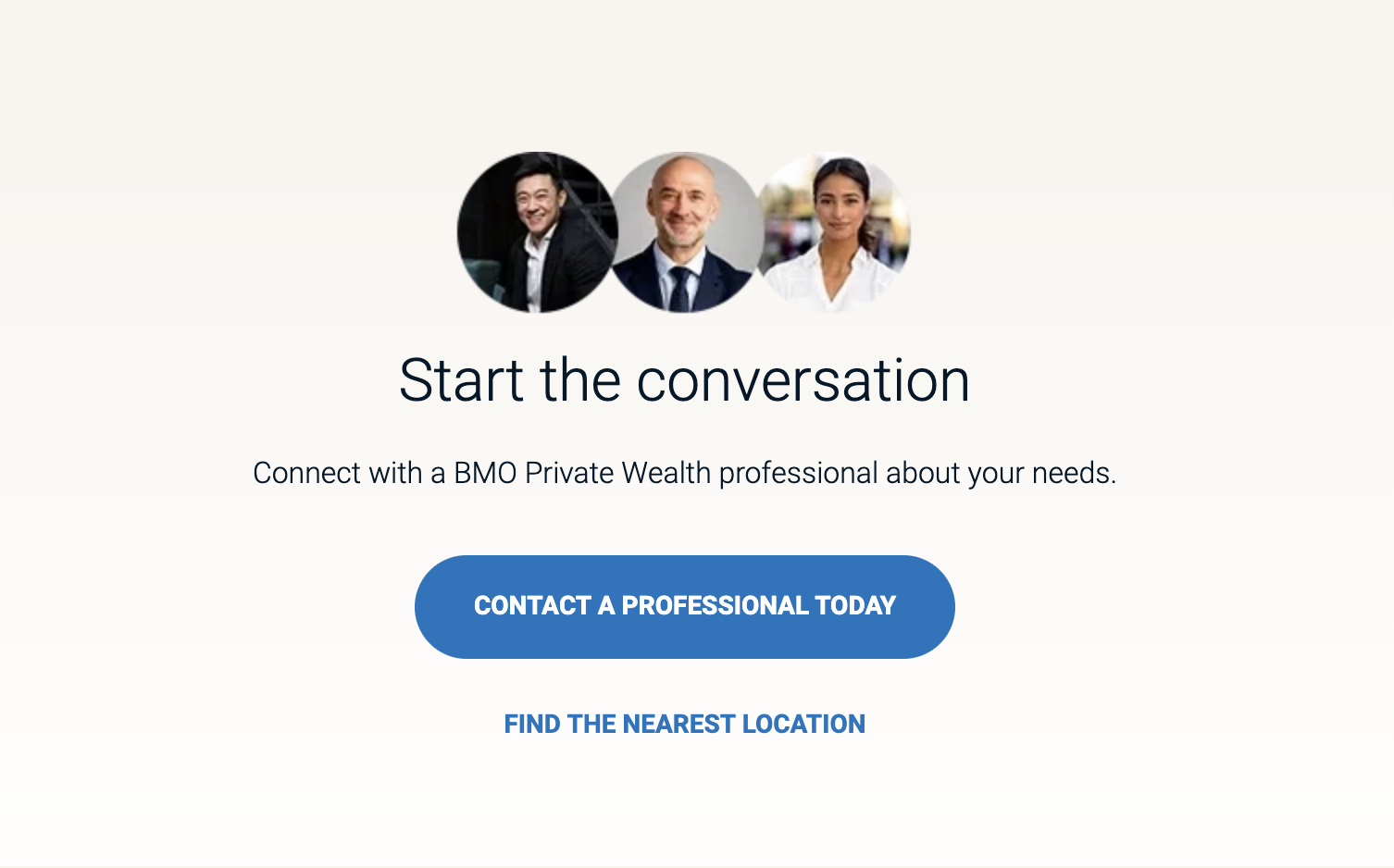
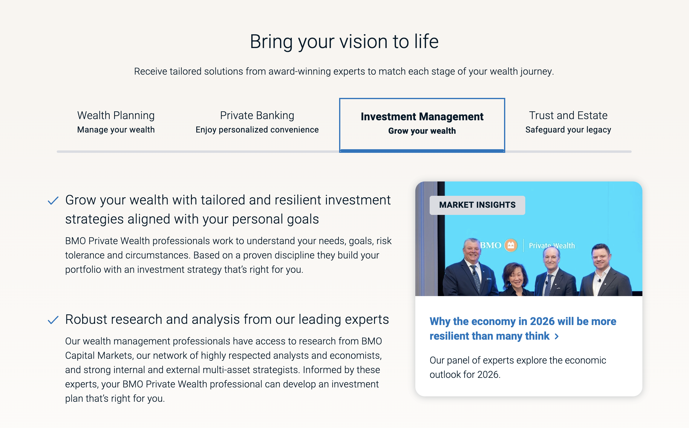
The original site was organized around BMO's internal service categories, described in terms of how BMO delivers them. Clients weren't arriving asking "What does BMO's investment division do?" — they arrived asking "How do I protect what I've built?" and "Why should I trust BMO over anyone else?"
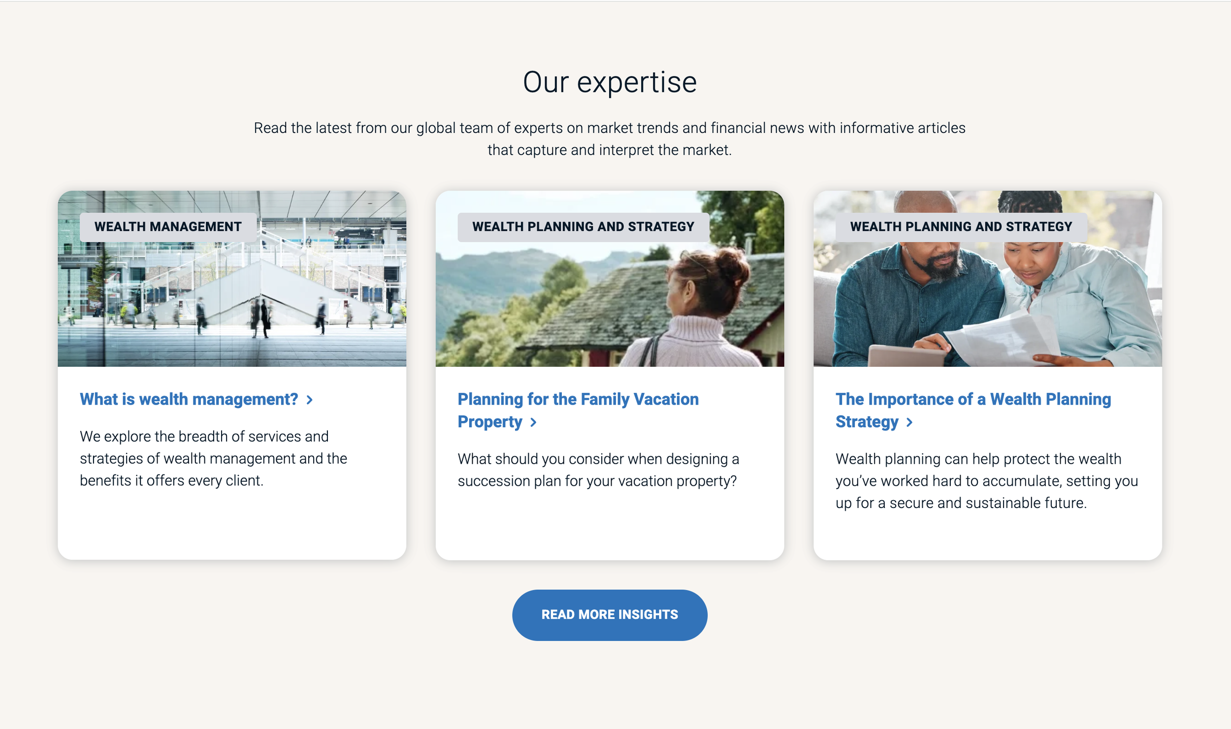
The redesign flipped the architecture. Every service was reframed around the client outcome it enables. "Wealth Planning" became "Your wealth plan is a living and breathing blueprint for your financial future." The shift from category label to client benefit was deliberate, tested, and measurable.
2. The copy was written for BMO, not for its clients
The Havas research consistently showed the existing copy centred BMO's perspective over the client's. Phrases like "We're passionate about your success" led with brand credentials rather than client goals — a common trap in financial services, where organizations default to proving credibility instead of demonstrating empathy.
For high-net-worth clients who already expect competence, what they're really evaluating is whether a firm understands their situation. The content needed to shift from "here's who we are" to "here's how we think about you" — rewritten through the lens of a client's ambitions, family, and legacy.
4. The imagery had to earn the premium positioning
The original site relied on stock photography of families and office settings — warm, but undifferentiated. For a brand competing at the top of the private wealth market, it sent the wrong signal. It looked like retail banking, not a destination for high-net-worth clients.
Research recommended a move toward aspirational, neutral imagery: Canadian landscapes, open horizons, natural light. These images carried meaning — expansive landscapes evoked possibility, calm water evoked stability. Pairing the right visual language with the new copy meant the page communicated its value proposition before a single word was read.
Private Wealth Homepage | BEFORE

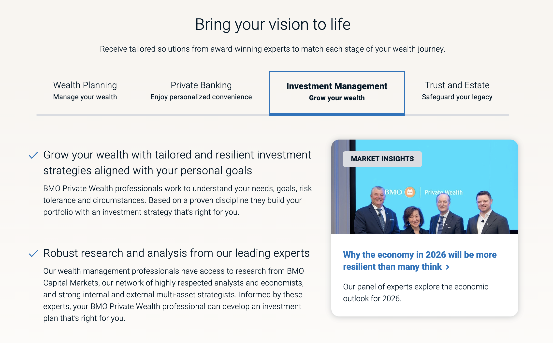
Private Wealth Homepage | AFTER
The Results: Content That Moved the Needle
After launch, the numbers told a clear story about what happens when content is built around the client, not the brand:
+96% increase in lead submissions
Nearly double the pipeline, driven by more empathetic CTAs and clearer value messaging.
+18% lift in organic traffic
More people finding, and staying on, a site that finally spoke their language.