Design Your Pages For Skeptics
ADNAN ZAMAN
SaaS buyers today are incredibly savvy and, frankly, a bit skeptical. Can you blame them? They’ve seen grand promises that under-deliver, free trials with hidden catches, and pricing that feels like a shell game. By the time someone lands on your pricing page, they likely have their guard up.

Designing for skeptics means anticipating that cautious mindset and baking credibility and reassurance into every element of your page. Do it right, and you’ll turn doubters into believers. Do it poorly, and even genuinely good deals will be met with hesitation or cynicism.
Lead with Radical Transparency
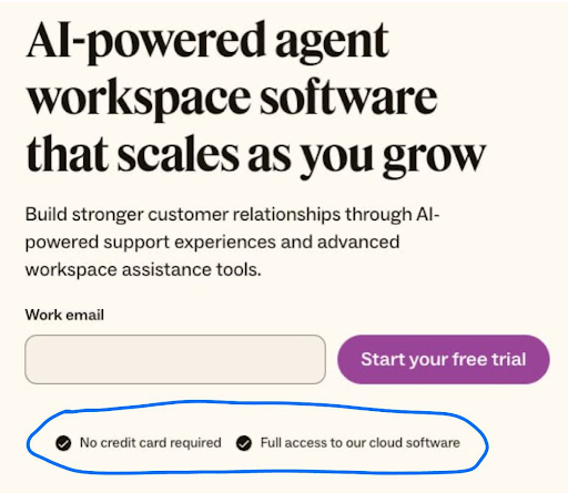
Nothing raises red flags faster than opaque pricing. If your visitor has even a whiff of “What are they hiding?” – game over. Be upfront about what’s included in each plan, what costs extra, and any limitations. For example, if your “Pro” plan has a cap on users or features that require an upgrade, spell that out. It’s far better to be honest on the page than to have a customer feel tricked later.
Transparency also means being clear about things like contract terms (month-to-month vs. annual), cancellation policies, and any setup fees. These might seem like small details, but they have an outsized impact on trust. A skeptic is looking for the fine print – so surface the important fine print proactively. A simple line like “Cancel anytime, no questions asked” or “All plans include a 30-day money-back guarantee” can dramatically lower the perceived risk of clicking that “Buy” or “Start Trial” button.
Let Your Customers Do the Convincing
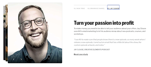
Leverage the voices your prospects do trust: your customers. It’s one thing for you to tout your product’s greatness, but a skeptic will think, “Of course you say that – you’re selling it.” However, a well-placed testimonial or two from real customers can crack that cynicism. Design your pricing page to include short testimonials or reviews that specifically address common objections. For instance, if price is a big concern, a testimonial might highlight value for money (“…ROI within two months, totally worth it”). If commitment is a worry, maybe someone notes how they “started on the basic plan and easily upgraded as our needs grew,” proving flexibility. Kit lays out a bunch of testimonials based on use cases for different types of users they’re targeting, like this one below.
Customer logos can also reassure enterprise buyers – seeing a logo wall of known companies using your solution signals, “others have vetted this, it’s safe.” For maximum credibility, include specifics: e.g., “Using XYZSoft saved us 10 hours a week – John, CTO of Acme Corp.” Specific outcomes feel concrete and believable, which is exactly what a wary prospect needs to see.

Design Like You Have Nothing to Hide
The visual design of your pricing page should also exude credibility. This is often subtle but powerful. A cluttered, ad-like page with aggressive flashing promos might trigger the skeptic’s “too salesy” alarm. Instead, aim for a clean, professional layout that matches the tone of your brand. Consistency is key – if the rest of your site is minimal and elegant, the pricing page shouldn’t suddenly look like a used-car ad. Trust is often lost in the details: low-quality images, typos, or inconsistent formatting can all create a subconscious impression of sloppiness or untrustworthiness. On the other hand, a polished page with clear headings, well-organized content, and a logical flow subconsciously tells the visitor, “This company is solid and has nothing to hide.”
Preempt Objections with Embedded Answers
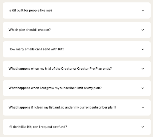
Address skepticism head-on by incorporating an FAQ section or tooltip pop-ups for common questions right on the pricing page. For example, skeptics might wonder: “What happens if I outgrow the plan? Are there overage fees? How responsive is support for the cheaper plan? Is my data safe?” Rather than making them hunt through your site or, worse, leave to search for reviews on Reddit or G2, provide answers in context. A few well-chosen FAQs or info icons can preempt a lot of doubt. This also shows that you understand your buyers’ concerns – which builds empathy and trust. It transforms your pricing page from a sales pitch into a helpful advisor. Imagine a skeptic thinking, “They’ve thought of everything I was worried about – maybe I can relax now.”
Humanize the Experience
Skeptics are ultimately people who have been burned or are cautious by nature; a bit of humanity can go a long way. If you have a “Talk to us” or live chat option on the pricing page, frame it as genuinely helpful (“Questions about which plan is right? Chat with a product expert, not a salesperson”).
If your team culture permits, a friendly note from the founders or a photo of your support team with a caption “We’re here to help you succeed” can make your company feel more approachable and real. The goal is to reduce the psychological distance between the prospect and your company. The more you seem like a trusted partner rather than a faceless vendor, the more a skeptic’s resistance melts away.
Stack Risk Reducers and Trust Signals
These are gold when designing for skeptics. We already mentioned money-back guarantees – if feasible, this is one of the strongest signals that you stand behind your product. Free trials or freemium plans are similarly powerful: they say, “We know you might not be convinced yet; try it on your terms.”

Even if you can’t offer a completely free option, consider a low-cost pilot or a detailed demo – something that shows you have confidence that once they see the product, they’ll be sold. Security badges (e.g., certifications like SOC2, GDPR compliance, etc.) and uptime guarantees can be crucial if your buyers worry about reliability or security. Any third-party endorsements or awards should be quietly highlighted – not to boast, but to reassure (“Voted #1 in Customer Satisfaction on G2” is essentially saying others trust us, so you can too).
Use Clear, Honest Microcopy
One often-overlooked aspect of building trust is language. The microcopy on your pricing page – the little descriptions, the fine print, even the call-to-action text – should be carefully chosen to sound honest and helpful. Avoid overly hypey language (“Ultimate Best Industry-Leading Platform!!!”), which savvy readers will roll their eyes at. Instead, use a confident but factual tone. If something isn’t included, say “Not included” rather than hiding it. If a feature is in beta or an add-on, label it clearly. When you use plain, straightforward language, you respect the reader’s intelligence – and a skeptic who feels respected is much more likely to reciprocate with trust.
In designing for skeptics, you essentially turn your pricing page into a trust-building landing page as much as a pricing sheet. Every element either adds to trust or detracts from it. By methodically adding trust signals, answering doubts, and showing proof, you tip the scale in favor of the visitor giving you the benefit of the doubt. And once you have that, the battle is mostly won. They can then focus on the value of your offering itself, rather than looking for reasons not to buy.
Summary
Remember that a skeptic is not a “no” – they’re a “maybe, but prove it to me.” Design your pricing page to prove it. Show that your value is real, that other customers vouch for you, that there’s no nasty surprise lurking in the contract, and that you’ll be there for them if they need help. Do this, and you’ll see more hesitant prospects step over the line and become confident, paying customers. Even better, those customers will remember that you earned their trust rather than assumed it – which is the perfect way to start a long-term customer relationship.