Your Pricing Page is the Moment of Truth
ADNAN ZAMAN
Picture this: a potential customer has navigated your site, engaged with your content, and now they've arrived at your pricing page. This is the exact point where interest converts into action. In SaaS, the pricing page quietly sits at the heart of your customer journey, yet it often doesn't get the attention it deserves.
Companies invest heavily in SEO, ads, and top-of-funnel content, but the pricing page, the very place decisions are made, frequently gets left on autopilot. It’s a costly irony. Your highest-intent prospects arrive at a page that hasn’t received nearly the strategic attention of your carefully crafted marketing campaigns.
The result? Missed revenue. SaaS companies that proactively optimize their pricing pages commonly see revenue boosts of 5 to 25%, transformative growth waiting to be captured. Even small improvements here can significantly impact your bottom line.
In short, your pricing page is your funnel’s moment of truth. Give it the strategic focus it deserves or risk losing high-intent prospects to competitors who will.
Your Highest-Intent Prospects Demand Instant Clarity
Visitors reaching your pricing page aren’t casual browsers. They’re your most qualified, highest-intent prospects. Clicking “Pricing” clearly communicates one thing: “I’m interested. Now show me why I should commit.”
Yet, despite this high intent, SaaS pricing pages typically convert only about 3 to 5% of visitors, meaning approximately 95 out of every 100 interested visitors leave empty-handed. At this critical decision-making point, any remaining doubts or friction become deal-breakers.
Your prospects arrive with critical questions in mind:
How much does this cost?
What exactly is included?
Will this actually solve my problem?
Can I trust this company?
Recent surveys highlight what SaaS buyers prioritize most on a pricing page:
81% want transparent pricing.
72% seek detailed product information.
64% expect a free trial option.
Today’s self-serve customers (nearly 100% of buyers across generations, compared to 87% previously) insist on finding these answers clearly laid out, without having to contact sales. If your pricing page fails to immediately deliver confidence, clarity, and an obvious path forward, your best prospects will quickly look elsewhere.
Make the First Impression Count
People judge your pricing page in about 50 milliseconds—that’s almost instant. Your design and copy need to quickly convey trust and simplicity. If your layout is cluttered or unclear, users think, "This looks complicated," and that's when hesitation creeps in.
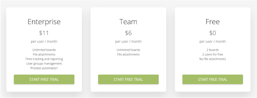
Your job is clarity. Make pricing tiers, top benefits, and calls-to-action obvious and easy to grasp right away. According to Hick’s Law, fewer choices help people decide faster and with less stress. In SaaS, three clear plans usually hit the sweet spot. Highlighting one option as "Most Popular" or "Best Value" leverages what's called the Von Restorff effect, making it stand out and easier to choose, like in the example below.
Like the book Strategic Writing for UX says, each word on your page should help users feel confident about their choice. Simple language, clear headings, and straightforward comparisons all help prospects think, "This makes sense—I'm ready."
Answer Prospects’ Unspoken Questions Early and Proactively
When a prospect lands on your pricing page, their mind is buzzing with small but critical questions. Think of it like someone leasing a car—they’re checking affordability, credit score, and insurance. Likewise, your prospects wonder, "Is this the right plan for me? What's included exactly? Are there hidden costs? What if I need to upgrade later? Can I easily cancel?"
If your page doesn't clearly address these concerns, each unanswered question becomes a reason not to buy. Be proactive. Clearly show differences between pricing tiers (no guesswork!), spotlight your free trials or money-back guarantees, and weave in social proof, like testimonials or customer logos. These small reassurances help clear away any doubts.

Great UX researchers remind us: guessing about your customer’s concerns is costly. Instead, tap into real insights through research and testing. Find out exactly what worries your buyers, and solve those issues right there on your pricing page.
Psychology Drives Decision-Making: Leverage It
Your pricing page isn’t just about facts—it's where emotion and logic intersect. Buyers constantly weigh what they'll gain against what they'll spend, a mental balancing act that isn't always rational. Behavioral research shows us clearly: the pain of losing money feels far stronger than the pleasure of gaining an equal amount.
How do you navigate this? Highlight outcomes over prices. Instead of just listing features, spell out concrete results: “Boost team productivity by 30%” or “Get 5 extra hours a week.” Frame your product not as an expense, but as a valuable investment in growth, revenue, or peace of mind. Use subtle reminders about what they lose by waiting—“Every day without automation is productivity lost.”
You can also use proven psychological techniques to gently nudge buyers forward. For example, anchoring sets a mental baseline—show a premium "Enterprise" plan first, making your other plans look attractive by comparison.
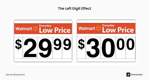
Or use charm pricing: a price ending in 9 (like $99) often feels significantly cheaper to buyers, even though it's only a small difference. In fact, prices ending in 9 typically boost sales by 24%.
Don’t underestimate the power of FOMO (Fear of Missing Out), either. Limited-time offers or real-time updates (“Jane signed up 5 minutes ago!”) add a subtle urgency. Always use these strategies ethically—but remember, when prospects are on the fence, a thoughtful nudge can tip the scale.
Trust is Your Conversion Currency: Use it
At the pricing page, everything comes down to trust. Buyers wonder, “Can I trust this company with my money and success?” Your page must answer with an immediate, confident “yes.” Trust isn’t built by words alone; it's built by signals your prospects notice instantly.
Start with visual trust signals. Clean design and professional branding convey quality instantly. People naturally associate attractive, well-designed interfaces with reliability (the aesthetic-usability effect). Reinforce security by clearly displaying badges like “SOC 2 Certified” or “SSL Secure Payment” near payment buttons.
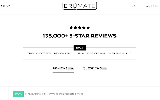
Social proof matters here too. Highlight testimonials or case studies at this critical moment. A short, specific quote such as “We boosted our revenue 20% after switching” can be the final nudge hesitant buyers need.
Finally, don’t let usability become a barrier. Visitors spend most of their online time elsewhere, building expectations based on common design patterns (Jakob’s Law). Keep your pricing page predictable and intuitive, with clear tiers like “Free,” “Pro,” and “Enterprise,” each with a simple, prominent CTA button. Predictable isn’t boring here; it’s reassuring. Reducing friction at this decisive stage lets your prospect focus on the value you offer instead of figuring out how to navigate your page.
Treat Your Pricing Page as a Strategic Growth Asset
Here’s what every SaaS leader needs to hear: Your pricing page is where customers say “yes” or quietly leave. It's the point where your entire product offering and marketing efforts come down to a single decision. If anything feels unclear or uncertain, your prospect is likely gone.
But if you treat this page as your secret growth weapon—continuously improving it through user research, surveys, heatmaps, and tests—you turn doubt into enthusiastic agreement. Simple A/B tests, like changing a button from “Submit” to “Get Started Today,” can lift conversions noticeably. It’s not about fixing what's broken; it's about seizing untapped opportunities.
Ultimately, never leave your most critical conversion point to chance. Infuse your pricing page with clarity, psychology-backed strategies, and empathetic communication. When done right, your pricing page becomes more than a stopping point—it’s the bridge that confidently moves prospects straight into your product. The decision is yours.
Want some personalized feedback on your pricing page?
I offer free 15-minute sessions, with zero sales pitches, just practical insights. I want you to walk away with at least one clear, actionable idea you can immediately apply. Interested? Just reply to this email and we’ll set it up.