
Connecting the Funnel with Pricing Clarity Across All Journey Touchpoints
ADNAN ZAMAN
We’ve journeyed together through many aspects of pricing page optimization, from psychology to personalization to onboarding. In this final newsletter of the series, let’s zoom out and examine the entire customer journey. A potential buyer might encounter your pricing in an ad, on your website, in a sales call, inside the product, and in renewal notices. To maximize conversions and trust, your pricing messaging must be consistent and clear across all these touchpoints. Let’s discuss how to connect the funnel so that a coherent pricing story is told from first impression to long-term use.
Modern B2B buyers engage with an astonishing number of touchpoints before making a decision – some research indicates at least 28 touches on averagelinkedin.com, and in complex deals it can be dozens moreupvise.co. These touches span different channels (website, email, social media, word-of-mouth, webinars, etc.) and different stages (awareness, consideration, decision, onboarding, expansion). If your pricing and value communication is inconsistent across these, you risk confusion or even appearing untrustworthy. For example, if an ad promises “Starting at $49/month” but the landing page shows plans starting at $99, that mismatch can immediately sour a prospect. Or if your sales team emphasizes one set of benefits for a plan, but your site lists another, it creates doubt.
Clarity is king at every stage. A guiding principle: never make a customer feel duped or surprised when it comes to price. That means from the first marketing interaction, set realistic expectations. If your pricing is usage-based or has add-ons, be upfront early. Don’t lure prospects under false pretenses only to “gotcha” them later – they’ll walk (or run) away. Transparency builds trust: according to one study, 94% of consumers are more likely to be loyal to a brand that offers complete pricing transparencypsico-smart.com. While that stat often applies to consumer goods, the spirit carries into B2B SaaS: business buyers hate hidden fees and fuzzy math just as much.
To connect the funnel, involve all customer-facing teams in understanding the pricing strategy and messaging. Marketing, sales, customer success, even finance should sing from the same song sheet. Establish a clear narrative: What is our value proposition? How do our pricing tiers map to customer outcomes (we covered this in JTBD and outcomes)? What analogies or stories do we use to explain pricing (e.g. “less than the cost of a coffee a day for X ROI”)? Ensure that an ebook, a website page, and a sales pitch all reinforce those same core points, just tailored to their format. When a theme repeats, it sticks – e.g., if “save 10 hours a month” is a key value of your Pro plan, that should be echoed in ads, on the pricing page, in the sales deck, and even in the app tooltip highlighting that plan’s features.
Another tip: maintain a single source of truth for pricing details. This could be an internal document or knowledge base that all teams reference when creating content or communications. It reduces the risk of outdated info floating around. For instance, if you change what’s included in a plan, update all touchpoints in sync – site, collateral, etc. Few things are worse than a prospect seeing one thing on your site and hearing another from a rep. It undermines credibility. Even post-sale, ensure that account managers and support know the customer’s plan details so they don’t accidentally promise something outside their plan without noting an upgrade need.
It’s also important to align incentives and messaging in promotional campaigns. If you run a limited-time discount or offer, make sure it’s clearly communicated wherever relevant. A user shouldn’t discover at checkout a discount they weren’t aware of (missing an opportunity to nudge them earlier), nor should they expect a discount due to some vague mention that then isn’t applied. Consistency here means if you say “20% off annual plans this month” in an email, the pricing page should reflect that (perhaps with a note or crossed-out original price) and sales reps should mention it too for people who come through live demos. Consistency in offers avoids the “but I saw X price somewhere else” friction at purchase time.
Now, consider the in-app experience. If someone is using your free trial, the messaging inside the product should align with what the marketing said. For example, if the trial is 14 days, the app might show a gentle reminder “You have 5 days left in your 14-day trial” – reaffirming the timeline promised. If certain features are trial-only or only in paid, clearly label them. Users appreciate honesty. Many apps smartly put a small lock icon or a tooltip “Available on Pro plan” next to features not in the current plan. This way the user isn’t mystified when they click something and nothing happens, or worse, they think it’s included only to lose access later.
Speaking of later, the renewal or expansion stage needs clarity too. A customer’s journey doesn’t end at purchase; renewal is a re-decision. Surprises here are deadly for trust. Imagine if at renewal the price goes up unannounced due to some clause or the discount expiring – if you haven’t been transparent about that from day one, expect anger. Always communicate pricing changes well in advance and remind customers of their current pricing entitlements. A great practice is a “90% usage” notice if they’re nearing a limit, coupled with a clear explanation of what happens if they exceed it (e.g. auto-upgrade, overage fees, or a friendly outreach to discuss options). No one likes surprise charges. It’s like the checkout experience in e-commerce: unexpected costs (like hidden fees) are the top cause of cart abandonment at 49%thegood.com. In SaaS, an analogous scenario is a surprise overage invoice – avoid those by being clear about pricing mechanics and keeping the customer informed.
Connecting the funnel also means consistency in tone and positioning. If your marketing frames your product as premium and high-value, but a sales rep suddenly offers a huge discount seemingly out of desperation, that mismatch can reduce perceived value. On the flip side, if marketing talks about affordability and then sales is very rigid on price, that frustrates buyers who expected flexibility. Strive for a cohesive pricing strategy that everyone aligns on – whether that’s “we offer occasional promotions” or “we maintain value, no heavy discounting” etc. That way, the customer isn’t hearing mixed signals.
Finally, gather feedback across the funnel. If you find prospects often asking the same pricing questions on sales calls (“so what exactly is included in X plan?” or “do I have to pay extra for Y?”), that might indicate your marketing materials or pricing page aren’t clear enough on those points. Fix it upstream. Similarly, if customer success reports confusion during renewals or usage, use that to refine how you communicate pricing policies early on. The funnel is connected on the customer side; internally, treat it as connected too by sharing insights.
Key Takeaways:
Unified messaging: Ensure all touchpoints – ads, website, sales conversations, in-app messaging, support – tell a consistent story about your pricing and value. Misalignment causes confusion and erodes trust.
No surprises: Be transparent about pricing structure (fees, limits, discounts, renewals) from the get-go. Unexpected costs or changes are a fast way to lose a deal or a customerthegood.com.
Update everywhere: When pricing or packaging changes, update every public-facing artifact. Keep teams in the loop so nobody is referencing the “old” info.
End-to-end clarity: Carry the same clear, customer-centric language from the first touch through the product experience. If you highlight a benefit in marketing, reiterate it when the user experiences that area of the product.
TL;DR: A cohesive and transparent pricing narrative across the entire customer journey builds confidence and credibility. Buyers should encounter the same core message about your pricing and value at every stage, reinforcing their understanding and trust. By aligning your teams and materials around a single clear pricing story, you remove friction from the funnel and pave the way for smoother conversions and renewals.
As we conclude this series, remember that optimizing your pricing page isn’t an isolated task – it’s part of a broader ecosystem of customer experience. When the pricing page is treated as the linchpin of a connected, customer-focused journey, it truly becomes the growth lever we set out to create. Thank you for following along through these nine deep dives. Here’s to turning more of your pricing page visitors into happy, long-term customers!
Want some personalized feedback on your funnel and setup?
I offer free 15-minute sessions, with zero sales pitches, just practical insights. I want you to walk away with at least one clear, actionable idea you can immediately apply. Interested? Just reply to this email and we’ll set it up.
Onboarding as a Long-Term Revenue Lever
ADNAN ZAMAN
Onboarding isn’t over after week one – not by a long shot. In fact, thinking of onboarding as a continuous process rather than a one-time event can unlock significant long-term revenue for your SaaS. In this eighth newsletter, we explore how a strong onboarding strategy extends into the entire customer lifecycle, driving higher retention, more expansion sales, and overall customer lifetime value. If you view onboarding as the “first chapter” in a customer’s journey with your product, it sets the tone for all chapters to follow.
Why focus on retention and expansion? Because keeping and growing existing customers is incredibly impactful. Studies have famously shown that increasing customer retention by just 5% can boost profits by 25% to 95%hbr.org. And one of the top reasons customers churn is they never fully adopt the product or see its value – essentially, incomplete onboarding. In fact, poor onboarding is cited as the third most important reason for churn (after poor fit and lack of engagement)userguiding.com. That means a significant portion of churn is preventable with better onboarding and customer success efforts. It’s not just about preventing churn either: well-onboarded customers are primed to expand usage, add seats, or upgrade plans down the line because they’re actually utilizing and deriving value from what they have.
So, what does ongoing onboarding look like in practice? It starts with the mindset that every time you introduce a new feature, enter a new contract period, or notice a change in user behavior, it’s an onboarding opportunity. For example, suppose you roll out a major new feature on your platform. Don’t assume users will discover it and figure it out themselves. Push a mini onboarding sequence: highlight it in-app (“New: Advanced Reports – let’s take a tour!”), offer a short tutorial, or host a webinar. This ensures your customers continuously learn how to get more value. A customer who keeps finding more utility in your product is far less likely to leave.
Similarly, consider milestone-based onboarding. When a customer upgrades to a higher tier, that’s a prime time to proactively onboard them to the new capabilities they’ve just unlocked. It’s like buying a fancy new appliance; you’d want to know all the cool things it can do, not just use it like your old one. If someone upgrades to your Enterprise plan, have your customer success team (or automated guidance if you’re low-touch) walk them through those enterprise features – perhaps advanced security settings, custom roles, or premium integrations. This not only ensures they use what they’re paying for, but also cements the feeling that “good thing we upgraded – we’re really benefiting here.”
We should also talk about the relationship between onboarding and product engagement. Onboarding is really about habit formation. Early on, it helps form the initial habit of using the product. But habits can fade, or users might not explore beyond their comfort zone. Periodic nudges, tips, and check-ins can re-ignite deeper product usage. For instance, if data shows a customer has stopped using a particular module that could deliver value to them, an automated “Did you know?” email or a quick personal check-in from a customer success manager can re-onboard them to that module. It’s much easier to revive usage in an existing account than to win a brand new account – you already have a foot in the door.
Another facet: onboarding new users within an existing customer organization. Say your customer account expands and adds 5 new team members onto the platform. Those new folks need onboarding too, or they might lag in adoption and reduce the overall team’s perceived value. Savvy SaaS companies provide scalable onboarding for these scenarios – perhaps an automated welcome for new seat holders with training resources, or even offering “refresher” training sessions that any user (new or old) can attend to sharpen their skills. This way, if the champion who originally bought your product leaves the company, the rest of the team isn’t lost – they’re well-versed and can carry on, ensuring that account stays with you.
Remember that good onboarding and engagement drive advocacy as well. Users who feel continually supported and educated become power users and often brand ambassadors. They’re more likely to adopt additional products or modules you offer (expanding their account) and to refer others. It’s a revenue lever indirectly through customer satisfaction and directly through upsells. Think of how many SaaS products introduce higher-tier features or complementary add-ons and rely on existing customers to take them. Those conversions won’t happen if customers are in the dark about those possibilities.
A concrete tip: consider implementing an “ongoing education” program, like a customer academy, certification program, or regular workshop series. Frame it not as marketing, but as part of the value of being a customer – you’re investing in their success. For example, a project management SaaS might have a monthly webinar “Mastering Advanced Timeline Planning” that’s free for all customers. This looks like a user enablement session (and it is), but it also subtly showcases a more advanced feature that might be in a higher plan or just underused. Customers attend to learn, and come away both more skilled and possibly interested in an upgrade or deeper usage. According to one user onboarding survey, a whopping 86% of customers say they’d stay more loyal to a business if they know they will have access to continuous educational and onboarding content post-saleuserguiding.com. So this isn’t just nice to have – it addresses a real driver of loyalty.
We should also address the tie between onboarding and support costs. While not a direct revenue, reducing churn and support expenses improves profitability. A well-onboarded user base encounters fewer issues and can self-serve more often. By proactively teaching best practices, you preempt “How do I do X?” support tickets. That frees your team to focus on higher-value activities like consulting with clients on optimization (which again can lead to expansion opportunities).
Key Takeaways:
Onboarding is never “done”: Treat onboarding as a continuous journey. Keep teaching customers how to get more value over time – especially when new features or plan upgrades occur.
Drive deep adoption: Ensure customers use the features they have (and are aware of features they don’t yet have). A deeply engaged customer is a retained and potentially expandable customer.
Milestone touchpoints: Use triggers like new user additions, plan changes, or even 90-days-in anniversaries to reach out with helpful guidance. Regular check-ins can catch declining engagement before it turns into churn.
Educate to elevate: Offer ongoing training, resources, and tips. This not only increases customer success but also builds loyalty and primes users for upsells when appropriate. A customer who feels supported will stick around.
TL;DR: Think of onboarding as a perpetual motion machine that fuels customer success and revenue long after the initial signup. Continuously onboard your users to new features and best practices so they keep realizing value. This leads to higher retention (protecting your revenue) and more expansion opportunities (growing your revenue). In short, happy, well-trained customers stick around and spend more.
With this approach, your onboarding becomes a competitive advantage. It’s part of your product’s value proposition that customers get not just software, but a partnership that helps them succeed. Now we’ve covered the full spectrum from first touch to long-term retention. In our final installment, we’ll tie everything together by ensuring your pricing strategy and communication are consistent across the entire funnel – from the first marketing interaction to renewal.
Want some personalized feedback on your funnel and setup?
I offer free 15-minute sessions, with zero sales pitches, just practical insights. I want you to walk away with at least one clear, actionable idea you can immediately apply. Interested? Just reply to this email and we’ll set it up.
Turning Freemium Users into Upgrades Through Better Onboarding
ADNAN ZAMAN
Many SaaS companies live and die by the “freemium funnel.” You attract users with a free plan or trial and then, hopefully, convert a healthy chunk of them into paying customers. But hope is not a strategy – onboarding is. In this seventh email, we focus on how a well-crafted onboarding experience can dramatically improve the conversion of free or trial users to paid plans. We’ll look at strategies to educate, engage, and motivate users during that crucial early period so they actually experience the value that makes upgrading a no-brainer.
First, let’s level-set with reality: typical freemium conversion rates hover around only 2–5%cxl.com. That means 95-98% of users might never upgrade if you do nothing special. The good news is that small improvements in onboarding can move that needle. Consider Evernote – they managed to hit a 6.5% conversion rate after implementing strong onboarding improvementswinsavvy.com. That’s a substantial bump in revenue when you have millions of free users. The key insight here is that users don’t convert just because time passes or because they signed up – they convert when they achieve an “aha moment” of value and see how your product can solve their problem. Onboarding’s job is to deliver that “aha” as quickly and smoothly as possible.
When a user first signs up for your free plan or trial, they’re essentially giving you a precious window of attention and goodwill. This is your chance to guide them. A common mistake is to treat free users as if they’ll magically self-serve and upgrade on their own. In reality, you should treat them like leads in a nurturing campaign. Use onboarding emails, in-app tours, tooltips, and even short tutorial videos to show them around. Remember, 75% of users will abandon a product if they can’t grasp how to use it within a weekuserguiding.com. That stat alone underscores how critical it is to get users competent and comfortable fast.
So what does a great onboarding flow look like for driving upgrades? It often starts with helping users reach their first success milestone. For example, if you offer a social media scheduling tool, getting a user to schedule their first post (and see it go live) could be that moment of value. Design your in-app onboarding to funnel them toward that action right away – perhaps with a friendly checklist: “1) Connect your social accounts, 2) Schedule your first post.” Celebrate it when they do (“Your post is scheduled! 🎉”). This positive reinforcement builds confidence and emotional investment.
Next, gradually expose the deeper value that lies in paid plans. On freemium, users might not know what they’re missing. Onboarding communications can highlight premium features in context, but more importantly the benefit of those features. For example, an email on day 5 of a trial could say, “Notice how you can schedule posts for one account? Upgrade to our Pro plan to manage all your social accounts in one place – no more juggling toolsfile-9hdm7c8jpmrddh8iuezx9c.” The messaging focuses on the outcome (manage all accounts seamlessly), enticing the user with how their life gets better with the upgrade.
One effective tactic is the use of usage thresholds or “soft limits” as motivational triggers. Slack famously doesn’t cut you off immediately; they let you use the free plan until 10,000 messages are reached, at which point they prompt an upgrade if you want to search older messages. By then, a team is hooked on the value (job done: team communication) and 10k messages implies they’ve had that aha repeatedly. Slack discovered that after 2,000 messages sent, 93% of those customers were still active (i.e., retained)anandvatsya.medium.com – a clear sign of habit formation and value. So, think about what metric in your product correlates with conversion propensity (messages sent, projects created, reports generated). Instrument your onboarding to drive toward that usage, and when users approach a free limit, gracefully show how upgrading removes friction or unlocks more joy. It’s crucial this comes off as helpful, not purely salesy: frame it as “You’re doing great – don’t let limits stop you!”
Another angle: personalize the onboarding content based on the user’s behavior or persona (tying back to Newsletter 6’s personalization). If you notice a freemium user is very active but not exploring a particular feature that’s a selling point of premium, your onboarding flow (via email or in-app hint) can nudge: “Hey, you’re really leveraging our task feature. Did you know you can automate recurring tasks with our Pro plan? Here’s how it could save you time…” Show, don’t just tell, the difference.
Educational content is part of onboarding too. Many users won’t upgrade because they haven’t fully realized the product’s value or capabilities. Webinars, guided tutorials, or drip emails that share “tips and tricks” can open their eyes. The trick is to tie these directly to upgrade reasons. For instance, host a short webinar “Getting the Most out of [YourProduct] (and how power users save 5 hours a week).” In that session, organically demonstrate something that’s only in the paid plan, and mention it: “This feature is available on our Pro plan, and as you can see it eliminates a bunch of manual work.” Now learning and sales pitch merge seamlessly.
Don’t overlook the power of social proof in onboarding. Case studies or mini testimonials specifically from users who upgraded can be compelling. An in-app message might say: “Meet Jane from XYZ Inc. She started on our free plan like you, and after 2 weeks upgraded to Pro. Why? ‘The workflow automation in Pro saved my team 10+ hours a month.’” It shows the user someone relatable who found success by upgrading.
Finally, make upgrading frictionless. If the user decides to convert, the UX should be smooth: a clear upgrade button, an easy way to input payment (ideally in-app, not making them hunt for the billing page), and reassurance (like “upgrade now, cancel anytime” or “14-day money-back guarantee”). Many eager users have dropped off due to a clunky upgrade process. Test it yourself – how many clicks from aha moment to paid?
Key Takeaways:
Onboarding = guiding to value: Use the onboarding period to lead users to their first “aha moment.” A user who experiences core value early is far more likely to consider paying.
Surface premium benefits early: Don’t hide all your best features behind a paywall without showing a taste. Let free users see what’s possible (through demos, trial periods, or usage prompts) and tie those features to the benefits they care about.
Communicate and educate: A structured onboarding email sequence can nurture free users by teaching them how to solve their problems using your product. Include subtle calls to upgrade when appropriate, emphasizing how it amplifies their success (e.g. more capacity, more automation, etc.).
Use triggers and prompts: Leverage in-app cues when users hit limits or exhibit behaviors that indicate readiness. A well-timed prompt (“Ready for more? Here’s what Pro offers…”) at a moment of peak engagement can feel helpful rather than intrusive.
TL;DR: Don’t leave freemium users to fend for themselves and expect conversion. Proactively guide them through onboarding to ensure they hit key milestones and see real value. By educating them and highlighting how upgrading expands that value, you create a natural progression from free to paid. Essentially, great onboarding nurtures free users into happy customers by showing them what they’re missing and how to get it.
When you master this, the freemium model becomes a growth engine rather than a leaky bucket. You’ll turn more trialers into loyal, paying advocates. Next, we’ll expand our view beyond just the conversion moment and discuss onboarding as a long-term revenue lever – not only for new users but for continually driving adoption and upsells over time.
Want some personalized feedback on your pricing page?
I offer free 15-minute sessions, with zero sales pitches, just practical insights. I want you to walk away with at least one clear, actionable idea you can immediately apply. Interested? Just reply to this email and we’ll set it up.
Your Pricing Page is the Moment of Truth
It All Begins Here
ADNAN ZAMAN
Picture this: a potential customer has navigated your site, engaged with your content, and now they've arrived at your pricing page. This is the exact point where interest converts into action. In SaaS, the pricing page quietly sits at the heart of your customer journey, yet it often doesn't get the attention it deserves.
Companies invest heavily in SEO, ads, and top-of-funnel content, but the pricing page, the very place decisions are made, frequently gets left on autopilot. It’s a costly irony. Your highest-intent prospects arrive at a page that hasn’t received nearly the strategic attention of your carefully crafted marketing campaigns.
The result? Missed revenue. SaaS companies that proactively optimize their pricing pages commonly see revenue boosts of 5 to 25%, transformative growth waiting to be captured. Even small improvements here can significantly impact your bottom line.
In short, your pricing page is your funnel’s moment of truth. Give it the strategic focus it deserves or risk losing high-intent prospects to competitors who will.

Your Highest-Intent Prospects Demand Instant Clarity
Visitors reaching your pricing page aren’t casual browsers. They’re your most qualified, highest-intent prospects. Clicking “Pricing” clearly communicates one thing: “I’m interested. Now show me why I should commit.”
Yet, despite this high intent, SaaS pricing pages typically convert only about 3 to 5% of visitors, meaning approximately 95 out of every 100 interested visitors leave empty-handed. At this critical decision-making point, any remaining doubts or friction become deal-breakers.
Your prospects arrive with critical questions in mind:
How much does this cost?
What exactly is included?
Will this actually solve my problem?
Can I trust this company?
Recent surveys highlight what SaaS buyers prioritize most on a pricing page:
81% want transparent pricing.
72% seek detailed product information.
64% expect a free trial option.
Today’s self-serve customers (nearly 100% of buyers across generations, compared to 87% previously) insist on finding these answers clearly laid out, without having to contact sales. If your pricing page fails to immediately deliver confidence, clarity, and an obvious path forward, your best prospects will quickly look elsewhere.
Make the First Impression Count
People judge your pricing page in about 50 milliseconds—that’s almost instant. Your design and copy need to quickly convey trust and simplicity. If your layout is cluttered or unclear, users think, "This looks complicated," and that's when hesitation creeps in.
Your job is clarity. Make pricing tiers, top benefits, and calls-to-action obvious and easy to grasp right away. According to Hick’s Law, fewer choices help people decide faster and with less stress. In SaaS, three clear plans usually hit the sweet spot. Highlighting one option as "Most Popular" or "Best Value" leverages what's called the Von Restorff effect, making it stand out and easier to choose, like in the example below.
Like the book Strategic Writing for UX says, each word on your page should help users feel confident about their choice. Simple language, clear headings, and straightforward comparisons all help prospects think, "This makes sense—I'm ready."
Answer Prospects’ Unspoken Questions Early and Proactively
When a prospect lands on your pricing page, their mind is buzzing with small but critical questions. Think of it like someone leasing a car—they’re checking affordability, credit score, and insurance. Likewise, your prospects wonder, "Is this the right plan for me? What's included exactly? Are there hidden costs? What if I need to upgrade later? Can I easily cancel?"
If your page doesn't clearly address these concerns, each unanswered question becomes a reason not to buy. Be proactive. Clearly show differences between pricing tiers (no guesswork!), spotlight your free trials or money-back guarantees, and weave in social proof, like testimonials or customer logos. These small reassurances help clear away any doubts.

Great UX researchers remind us: guessing about your customer’s concerns is costly. Instead, tap into real insights through research and testing. Find out exactly what worries your buyers, and solve those issues right there on your pricing page.
Psychology Drives Decision-Making: Leverage It
Your pricing page isn’t just about facts—it's where emotion and logic intersect. Buyers constantly weigh what they'll gain against what they'll spend, a mental balancing act that isn't always rational. Behavioral research shows us clearly: the pain of losing money feels far stronger than the pleasure of gaining an equal amount.
How do you navigate this? Highlight outcomes over prices. Instead of just listing features, spell out concrete results: “Boost team productivity by 30%” or “Get 5 extra hours a week.” Frame your product not as an expense, but as a valuable investment in growth, revenue, or peace of mind. Use subtle reminders about what they lose by waiting—“Every day without automation is productivity lost.”
You can also use proven psychological techniques to gently nudge buyers forward. For example, anchoring sets a mental baseline—show a premium "Enterprise" plan first, making your other plans look attractive by comparison.
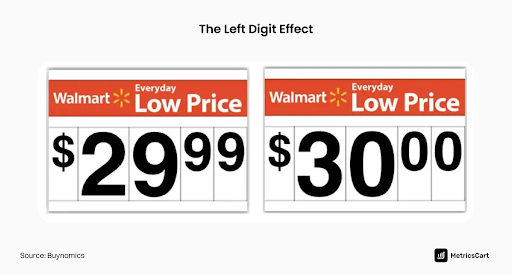
Or use charm pricing: a price ending in 9 (like $99) often feels significantly cheaper to buyers, even though it's only a small difference. In fact, prices ending in 9 typically boost sales by 24%.
Don’t underestimate the power of FOMO (Fear of Missing Out), either. Limited-time offers or real-time updates (“Jane signed up 5 minutes ago!”) add a subtle urgency. Always use these strategies ethically—but remember, when prospects are on the fence, a thoughtful nudge can tip the scale.
Trust is Your Conversion Currency: Use it
At the pricing page, everything comes down to trust. Buyers wonder, “Can I trust this company with my money and success?” Your page must answer with an immediate, confident “yes.” Trust isn’t built by words alone; it's built by signals your prospects notice instantly.
Start with visual trust signals. Clean design and professional branding convey quality instantly. People naturally associate attractive, well-designed interfaces with reliability (the aesthetic-usability effect). Reinforce security by clearly displaying badges like “SOC 2 Certified” or “SSL Secure Payment” near payment buttons.
Social proof matters here too. Highlight testimonials or case studies at this critical moment. A short, specific quote such as “We boosted our revenue 20% after switching” can be the final nudge hesitant buyers need.
Finally, don’t let usability become a barrier. Visitors spend most of their online time elsewhere, building expectations based on common design patterns (Jakob’s Law). Keep your pricing page predictable and intuitive, with clear tiers like “Free,” “Pro,” and “Enterprise,” each with a simple, prominent CTA button. Predictable isn’t boring here; it’s reassuring. Reducing friction at this decisive stage lets your prospect focus on the value you offer instead of figuring out how to navigate your page.
Treat Your Pricing Page as a Strategic Growth Asset
Here’s what every SaaS leader needs to hear: Your pricing page is where customers say “yes” or quietly leave. It's the point where your entire product offering and marketing efforts come down to a single decision. If anything feels unclear or uncertain, your prospect is likely gone.
But if you treat this page as your secret growth weapon—continuously improving it through user research, surveys, heatmaps, and tests—you turn doubt into enthusiastic agreement. Simple A/B tests, like changing a button from “Submit” to “Get Started Today,” can lift conversions noticeably. It’s not about fixing what's broken; it's about seizing untapped opportunities.
Ultimately, never leave your most critical conversion point to chance. Infuse your pricing page with clarity, psychology-backed strategies, and empathetic communication. When done right, your pricing page becomes more than a stopping point—it’s the bridge that confidently moves prospects straight into your product. The decision is yours.
Want some personalized feedback on your pricing page?
I offer free 15-minute sessions, with zero sales pitches, just practical insights. I want you to walk away with at least one clear, actionable idea you can immediately apply. Interested? Just reply to this email and we’ll set it up.

The 7±2 Rule in Action: Simplicity Sells on the Pricing Page
It All Begins Here
ADNAN ZAMAN
Cognitive Overload is Real
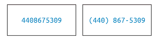
“Less is more” is a cliché in design for a reason – our brains can only handle so much at once. In psychology, there’s a classic principle called Miller’s Law, often paraphrased as the magic number seven, plus or minus two. It suggests that the average person can hold about 5–9 items in their short-term memory. Beyond that, our mental circuits start to fry – we get overwhelmed, confused, and indecisive.
The simplest example of chunking is a phone number. As a long string of digits, it's hard to process—but when grouped (e.g., 555-123-4567), it becomes far easier to read and remember.
Now, think about your pricing page. How many choices, features, and pieces of information are you throwing at prospects in that one view? If it’s more than a handful, you might be triggering analysis paralysis rather than confidence.
On a pricing page, the 7±2 rule translates to a simple mandate: simplify the decision space. This doesn’t mean dumbing down your offering or hiding information; it means structuring and presenting your pricing options in a digestible way…like this example by smile.io.
Too Many Pricing Tiers? You’re Losing Sales
Consider the number of pricing tiers you offer. While it’s tempting to create a plan for every possible segment (“Small, Medium, Large, XL, Enterprise, Super Enterprise…”), too many options can backfire. Prospects faced with a menu of eight different plans will likely struggle to figure out which is best for them – a phenomenon known as choice overload.

A famous study on jam sales illustrated this well: when consumers were offered 24 flavors of jam, only 3% made a purchase, but when the choice was limited to 6 jams, an astonishing 30% purchaseddigitalwellbeing.org. The takeaway? More choice can lead to less action. People feel safer choosing when the options are limited and clear.
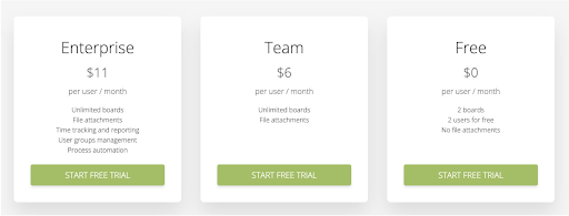
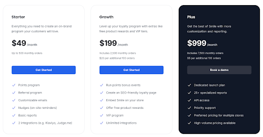
For SaaS pricing, the sweet spot for number of plans is often around three (give or take one). There’s a reason “Good/Better/Best” tiered pricing is ubiquitous – it offers enough contrast to help different buyers find a fit, but not so much as to overwhelm. Three plans also allow you to leverage the Goldilocks effect: one tier is too basic, one too advanced, and the middle option appears “just right” for a large swath of customers.
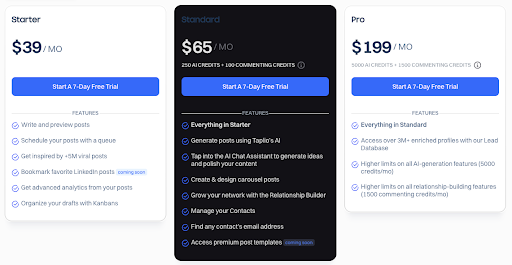
This plays to how our brains evaluate choices; with three, it’s easier to make a comparative judgment. If you currently have, say, five or six plans visible, ask if they can be consolidated or at least visually de-emphasized (for example, grouping enterprise options under an “Enterprise solutions” umbrella rather than showing 4 enterprise flavors in the main comparison table).
Forget the Feature Dump. Lead with What Matters
Beyond the number of plans, apply the 7±2 rule to features and bullets as well. It’s common to see pricing tables that list dozens of feature checkmarks under each tier, in an attempt to be thorough. The intent is good – you want to communicate everything the customer gets. But remember, a wall of checkmarks is not convincing; it’s paralyzing.
If a prospect has to scroll a mile or mentally keep track of 15–20 differences, they’ll likely give up or misinterpret something. Instead, focus on the key 5 or so benefits/features that differentiate each plan. What are the core value drivers for someone to choose Premium vs. Standard? Lead with those.
You can always include a “See all features” expandable section or a detailed spec sheet elsewhere for the few who want to dive deep. Your main pricing page should prioritize clarity over completeness. The goal is to get the prospect to identify which tier could work for them – not to answer every technical question at once.
Chunk Features into Categories for Better Clarity
Another tactic is chunking information into categories, which is essentially grouping items so each group counts as “one” in that 7±2 mental limit. For example, instead of listing 12 separate features, categorize them into 3 groups like “Collaboration Features,” “Security,” and “Support,” with a few points under each.
This way, the reader’s brain first processes 3 groups (manageable), then can drill into a group of 3–4 items (also manageable). Chunking leverages our brain’s natural tendency to remember grouped information better than a long list of unrelated points.
Design with Visual Hierarchy, Not a Spreadsheet
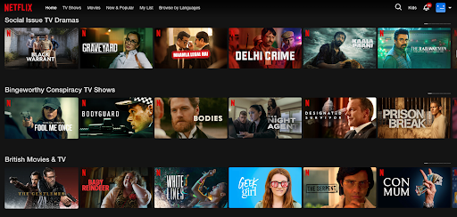
Let’s not forget the power of visual hierarchy in simplifying decisions. A clean, uncluttered design with clear headings, ample white space, and perhaps one highlighted “recommended” plan can do wonders to guide the eye. Netflix seems to have settled on six as its magic number. Each menu and carousel is presented on the homepage as a separate chunk, offering six options.
If your pricing page currently looks like a dense spreadsheet, it’s time for a makeover. Emphasize the essentials: price, plan name, top benefits. Use icons or checkmarks sparingly to indicate presence/absence of a feature – and only for features that truly matter to the decision. The rest can be footnotes or hidden until a user clicks “compare details.”
Offer Options That Don’t Overwhelm
Real-world examples abound. Most successful SaaS companies err on the side of fewer choices. Think of services like Slack or Zoom – they present a limited set of plans (with enterprise as a separate discussion, not another confusing self-serve tier).
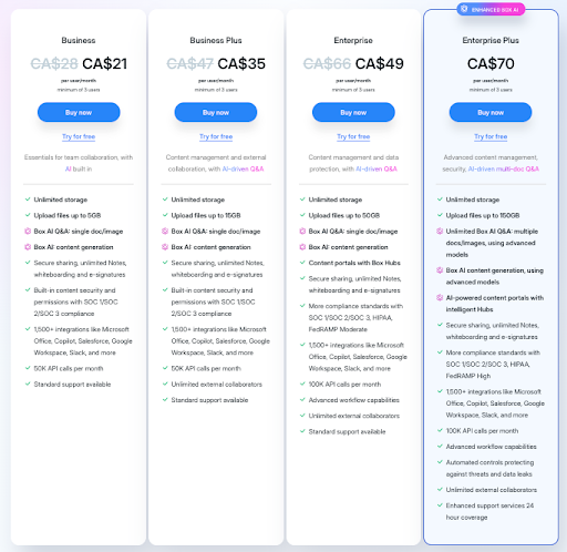
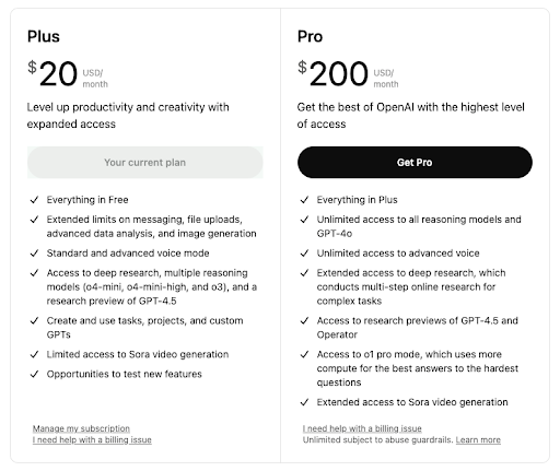
Even complex products often showcase just 2–4 main editions on their site, because they know too many options will reduce overall conversions — like ChaptGPT’s pricing page below. If you do need to offer a wide range (maybe you serve vastly different customer segments), consider a plan selector wizard: ask a couple of questions and then recommend a plan, rather than forcing the user to self-serve from a litany of choices.
Help Buyers Choose with Confidence
In action, the 7±2 rule is about empathy: put yourself in your buyer’s shoes. When they arrive at your pricing page, they’re asking, “Which of these options is right for me? And what am I getting?” Give them a straightforward path to the answer. By simplifying and structuring your pricing information, you’ll not only make the experience less stressful, you’ll also instill confidence. A prospect who isn’t overwhelmed is more likely to click “Buy” with conviction.

Summary
Don’t confuse your buyers with too much choice or information. Every additional option or line on your pricing page should earn its place by delivering clear value to the evaluation process. If it doesn’t, consider removing or consolidating it. In the quest for transparency, it’s possible to go overboard and create cognitive chaos. The best pricing pages find that sweet spot of informative yet concise, giving prospects just enough to say “aha, I see which plan works for me,” and nothing more. Remember, simplicity sells – and it also delights.
Want some personalized feedback on your pricing page?
I offer free 15-minute sessions, with zero sales pitches, just practical insights. I want you to walk away with at least one clear, actionable idea you can immediately apply. Interested? Just reply to this email and we’ll set it up.

Design Your Pages For Skeptics
It All Begins Here
ADNAN ZAMAN
SaaS buyers today are incredibly savvy and, frankly, a bit skeptical. Can you blame them? They’ve seen grand promises that under-deliver, free trials with hidden catches, and pricing that feels like a shell game. By the time someone lands on your pricing page, they likely have their guard up.

Designing for skeptics means anticipating that cautious mindset and baking credibility and reassurance into every element of your page. Do it right, and you’ll turn doubters into believers. Do it poorly, and even genuinely good deals will be met with hesitation or cynicism.
Lead with Radical Transparency
Nothing raises red flags faster than opaque pricing. If your visitor has even a whiff of “What are they hiding?” – game over. Be upfront about what’s included in each plan, what costs extra, and any limitations. For example, if your “Pro” plan has a cap on users or features that require an upgrade, spell that out. It’s far better to be honest on the page than to have a customer feel tricked later.
Transparency also means being clear about things like contract terms (month-to-month vs. annual), cancellation policies, and any setup fees. These might seem like small details, but they have an outsized impact on trust. A skeptic is looking for the fine print – so surface the important fine print proactively. A simple line like “Cancel anytime, no questions asked” or “All plans include a 30-day money-back guarantee” can dramatically lower the perceived risk of clicking that “Buy” or “Start Trial” button.
Let Your Customers Do the Convincing
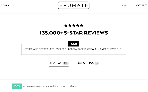
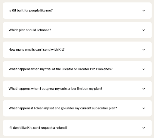
Leverage the voices your prospects do trust: your customers. It’s one thing for you to tout your product’s greatness, but a skeptic will think, “Of course you say that – you’re selling it.” However, a well-placed testimonial or two from real customers can crack that cynicism. Design your pricing page to include short testimonials or reviews that specifically address common objections. For instance, if price is a big concern, a testimonial might highlight value for money (“…ROI within two months, totally worth it”). If commitment is a worry, maybe someone notes how they “started on the basic plan and easily upgraded as our needs grew,” proving flexibility. Kit lays out a bunch of testimonials based on use cases for different types of users they’re targeting, like this one below.

Customer logos can also reassure enterprise buyers – seeing a logo wall of known companies using your solution signals, “others have vetted this, it’s safe.” For maximum credibility, include specifics: e.g., “Using XYZSoft saved us 10 hours a week – John, CTO of Acme Corp.” Specific outcomes feel concrete and believable, which is exactly what a wary prospect needs to see.

Design Like You Have Nothing to Hide
The visual design of your pricing page should also exude credibility. This is often subtle but powerful. A cluttered, ad-like page with aggressive flashing promos might trigger the skeptic’s “too salesy” alarm. Instead, aim for a clean, professional layout that matches the tone of your brand. Consistency is key – if the rest of your site is minimal and elegant, the pricing page shouldn’t suddenly look like a used-car ad. Trust is often lost in the details: low-quality images, typos, or inconsistent formatting can all create a subconscious impression of sloppiness or untrustworthiness. On the other hand, a polished page with clear headings, well-organized content, and a logical flow subconsciously tells the visitor, “This company is solid and has nothing to hide.”
Preempt Objections with Embedded Answers
Address skepticism head-on by incorporating an FAQ section or tooltip pop-ups for common questions right on the pricing page. For example, skeptics might wonder: “What happens if I outgrow the plan? Are there overage fees? How responsive is support for the cheaper plan? Is my data safe?” Rather than making them hunt through your site or, worse, leave to search for reviews on Reddit or G2, provide answers in context. A few well-chosen FAQs or info icons can preempt a lot of doubt. This also shows that you understand your buyers’ concerns – which builds empathy and trust. It transforms your pricing page from a sales pitch into a helpful advisor. Imagine a skeptic thinking, “They’ve thought of everything I was worried about – maybe I can relax now.”
Humanize the Experience
Skeptics are ultimately people who have been burned or are cautious by nature; a bit of humanity can go a long way. If you have a “Talk to us” or live chat option on the pricing page, frame it as genuinely helpful (“Questions about which plan is right? Chat with a product expert, not a salesperson”).
If your team culture permits, a friendly note from the founders or a photo of your support team with a caption “We’re here to help you succeed” can make your company feel more approachable and real. The goal is to reduce the psychological distance between the prospect and your company. The more you seem like a trusted partner rather than a faceless vendor, the more a skeptic’s resistance melts away.
Stack Risk Reducers and Trust Signals
These are gold when designing for skeptics. We already mentioned money-back guarantees – if feasible, this is one of the strongest signals that you stand behind your product. Free trials or freemium plans are similarly powerful: they say, “We know you might not be convinced yet; try it on your terms.”

Even if you can’t offer a completely free option, consider a low-cost pilot or a detailed demo – something that shows you have confidence that once they see the product, they’ll be sold. Security badges (e.g., certifications like SOC2, GDPR compliance, etc.) and uptime guarantees can be crucial if your buyers worry about reliability or security. Any third-party endorsements or awards should be quietly highlighted – not to boast, but to reassure (“Voted #1 in Customer Satisfaction on G2” is essentially saying others trust us, so you can too).
Use Clear, Honest Microcopy
One often-overlooked aspect of building trust is language. The microcopy on your pricing page – the little descriptions, the fine print, even the call-to-action text – should be carefully chosen to sound honest and helpful. Avoid overly hypey language (“Ultimate Best Industry-Leading Platform!!!”), which savvy readers will roll their eyes at. Instead, use a confident but factual tone. If something isn’t included, say “Not included” rather than hiding it. If a feature is in beta or an add-on, label it clearly. When you use plain, straightforward language, you respect the reader’s intelligence – and a skeptic who feels respected is much more likely to reciprocate with trust.
In designing for skeptics, you essentially turn your pricing page into a trust-building landing page as much as a pricing sheet. Every element either adds to trust or detracts from it. By methodically adding trust signals, answering doubts, and showing proof, you tip the scale in favor of the visitor giving you the benefit of the doubt. And once you have that, the battle is mostly won. They can then focus on the value of your offering itself, rather than looking for reasons not to buy.
Summary
Remember that a skeptic is not a “no” – they’re a “maybe, but prove it to me.” Design your pricing page to prove it. Show that your value is real, that other customers vouch for you, that there’s no nasty surprise lurking in the contract, and that you’ll be there for them if they need help. Do this, and you’ll see more hesitant prospects step over the line and become confident, paying customers. Even better, those customers will remember that you earned their trust rather than assumed it – which is the perfect way to start a long-term customer relationship.