CIBC · Content strategy and information architecture
Turning CIBC Investor Relations into a task-driven hub
The Investor Relations page held everything an investor needed, but buried it. I restructured the page around the tasks investors come to complete and rewrote it so the most valuable resources are a glance away.
- My role
- Content Designer, the only content designer on the project
- I owned
- Content strategy, page structure and hierarchy, section and navigation labels, and all page copy
- Audience
- Investors, analysts and shareholders
The page opened with a generic welcome, scattered key resources across link grids, and buried executive presentations in a long list.
Rebuilt the page around investor tasks: a clear proposition with the most-used document up top, in-page navigation, grouped resources, scannable presentation cards, and four proof points on why to invest.
A page that works as a task hub instead of a static information page, with every key resource reachable from the first screen.
The problem
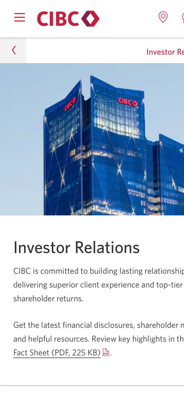
Investors visit an Investor Relations page with a job to do: check the latest results, grab the fact sheet, watch an executive presentation, or find who to contact. The existing page treated all of that as one long information dump.
A weak proposition above the fold
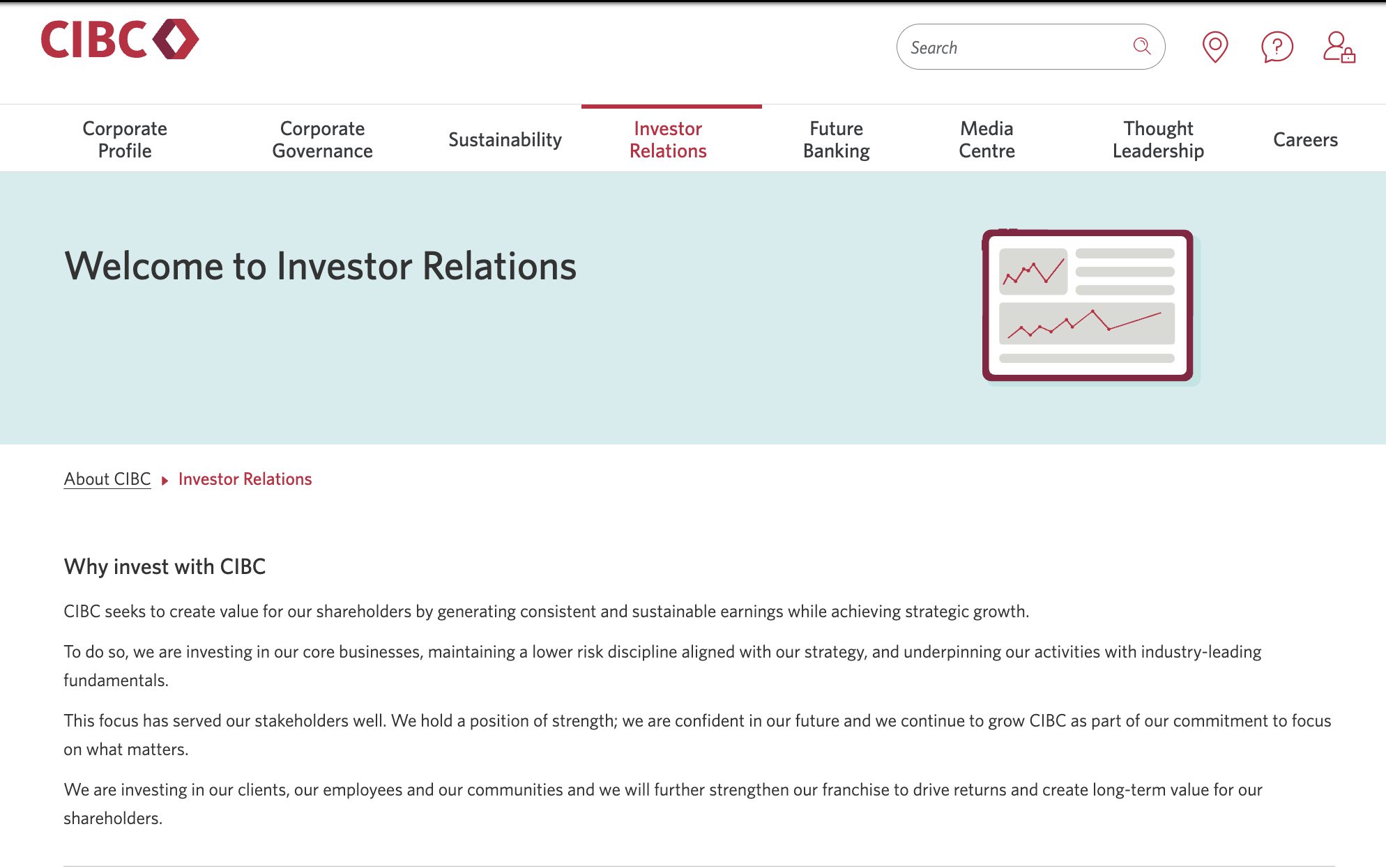
"Welcome to Investor Relations" told investors nothing, and nothing useful sat on the first screen.
Key tasks fragmented
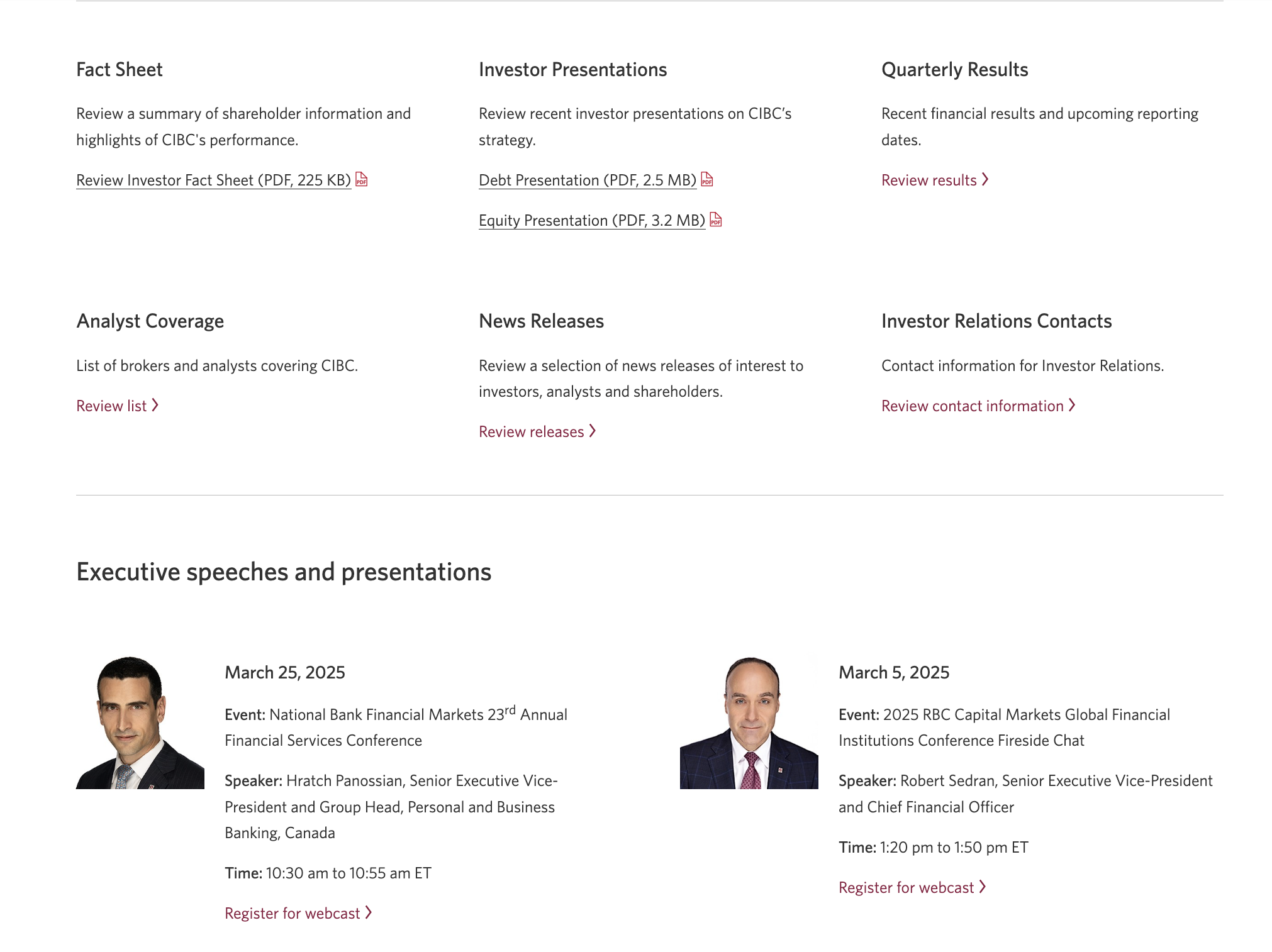
Fact sheet, presentations, results, analyst coverage and contacts were six equal boxes, then repeated in link lists further down.
Presentations hard to scan
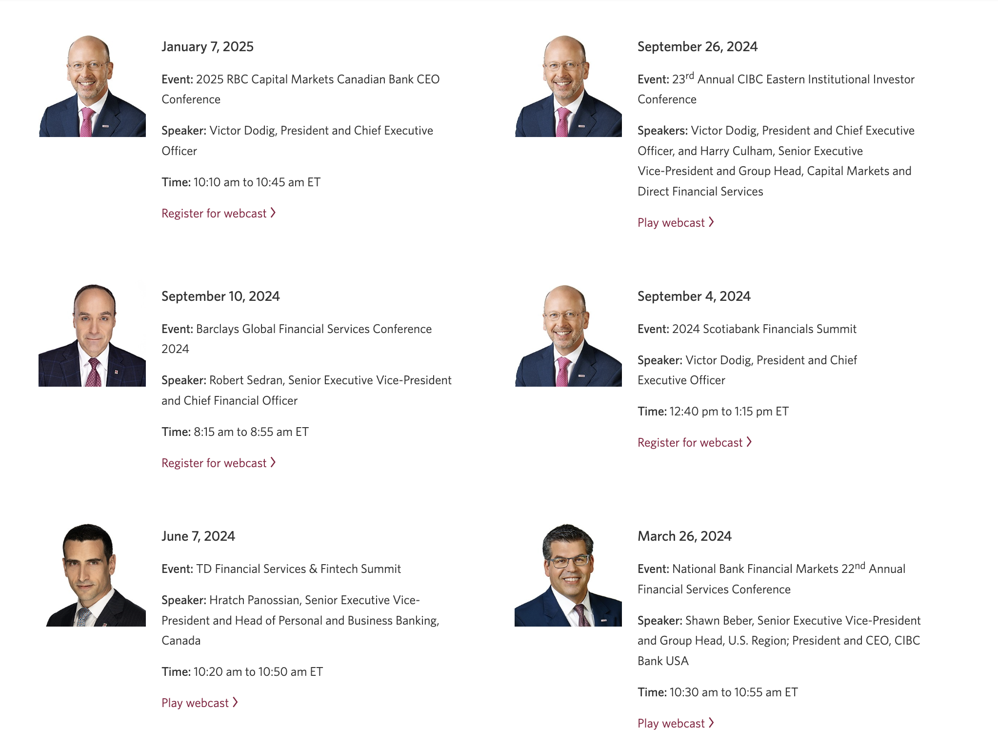
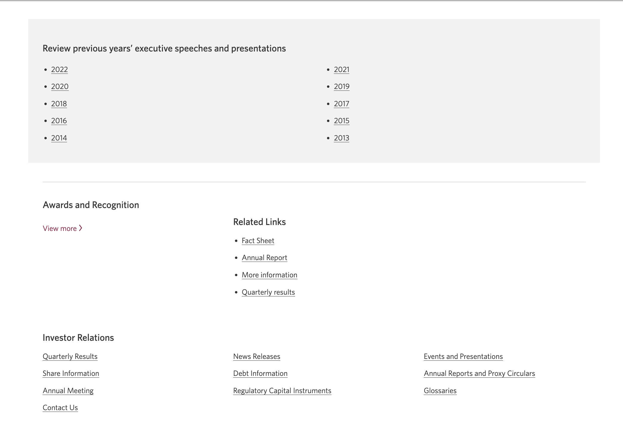
Speeches ran as a long text list, followed by a wall of year links back to 2013.
No narrative
"Why invest" was four paragraphs of corporate statements with no hierarchy or proof points.
My content strategy
- Answer "what can I do here?" on the first screen. State the page's value and put the most-requested resource one click away.
- Organize by investor task, not by document type. Group resources into a few clear jobs and give the page its own navigation.
- Make every list scannable. Lead with the detail investors scan for (the date) and put the rest underneath.
- Turn claims into proof points. Replace paragraphs with short headlines an analyst can skim, each backed by one supporting line.
From strategy to copy
From a greeting to a proposition
"Welcome to Investor Relations"
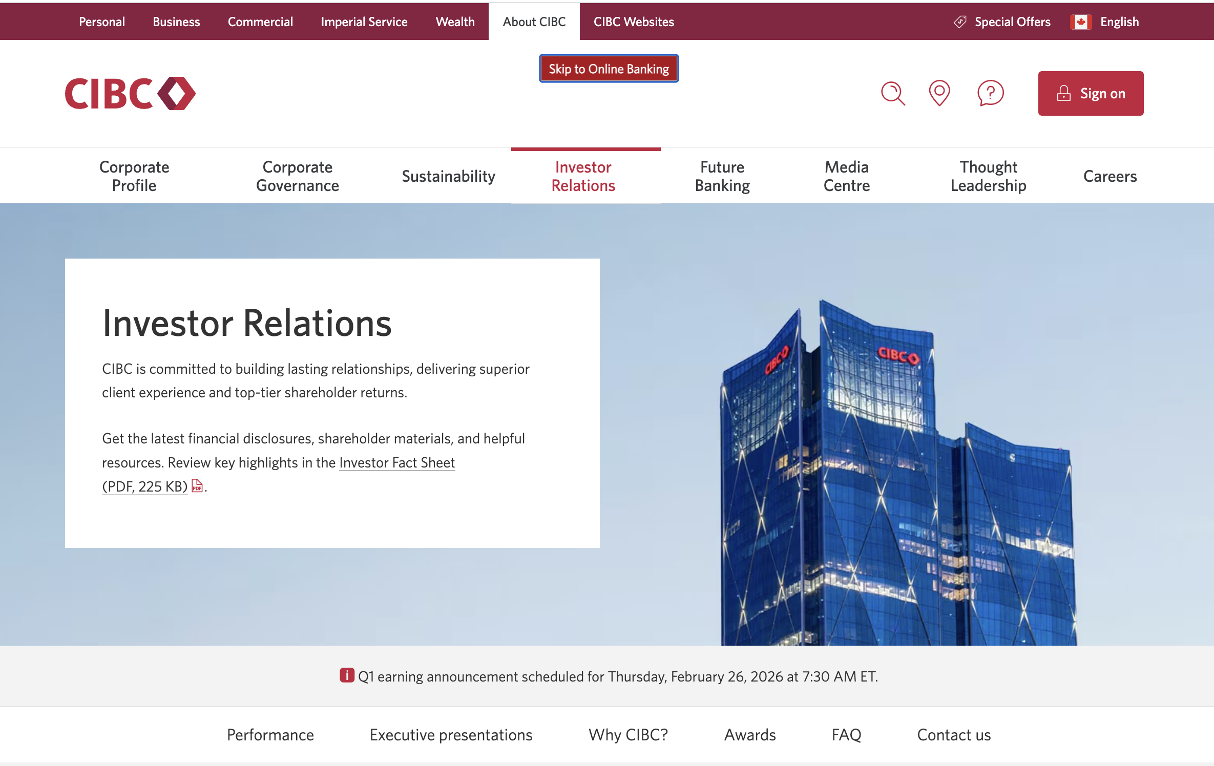
"Investor Relations. CIBC is committed to building lasting relationships, delivering superior client experience and top-tier shareholder returns."
"Get the latest financial disclosures, shareholder materials, and helpful resources. Review key highlights in the Investor Fact Sheet (PDF, 225 KB)."
A banner below the hero now announces the next earnings date, the most time-sensitive thing an investor checks for.
A page with its own navigation
Six equal boxes: Fact Sheet · Investor Presentations · Quarterly Results · Analyst Coverage · News Releases · Investor Relations Contacts, then repeated link lists below
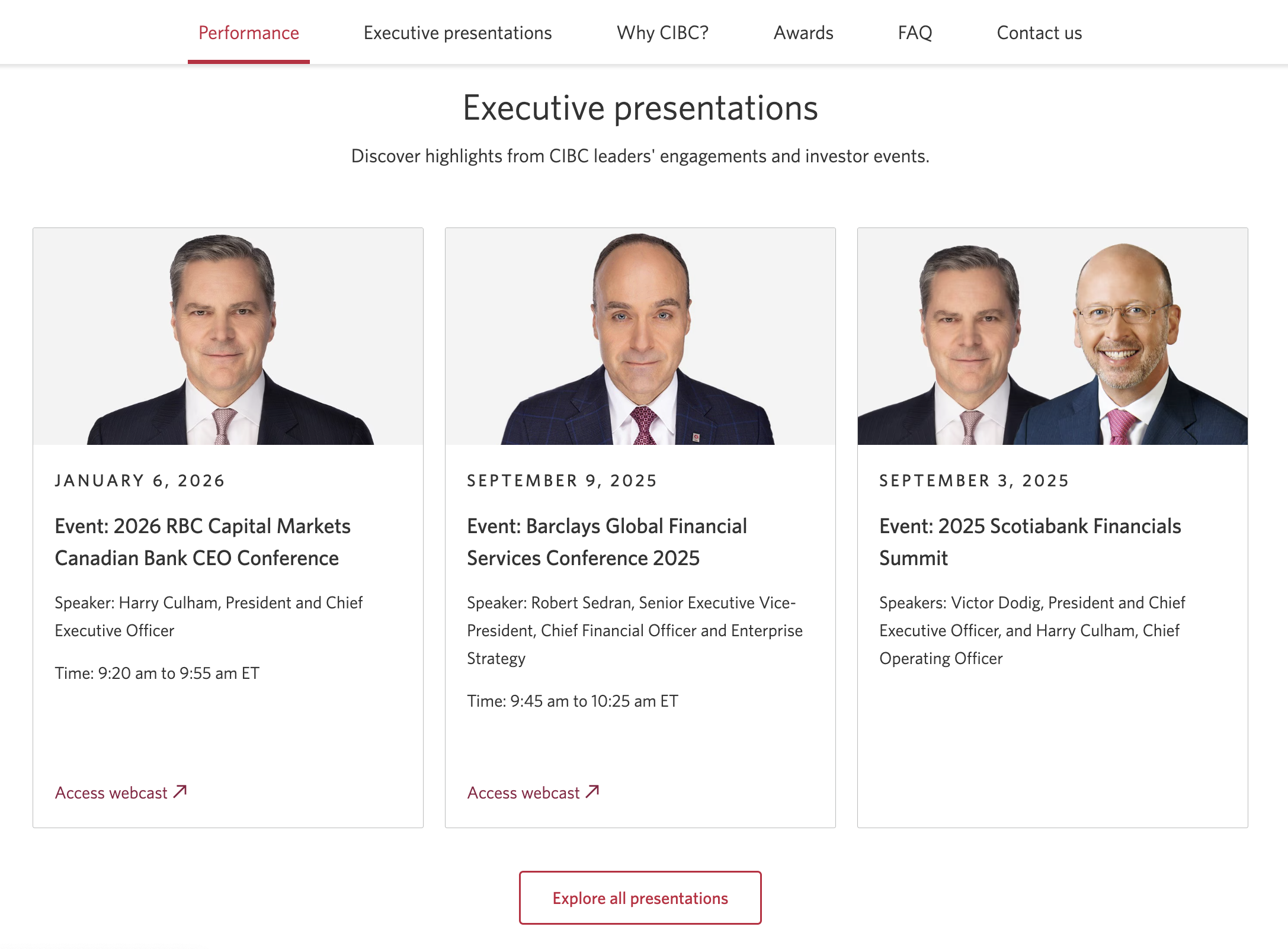
In-page navigation: Performance · Executive presentations · Why CIBC? · Awards · FAQ · Contact us
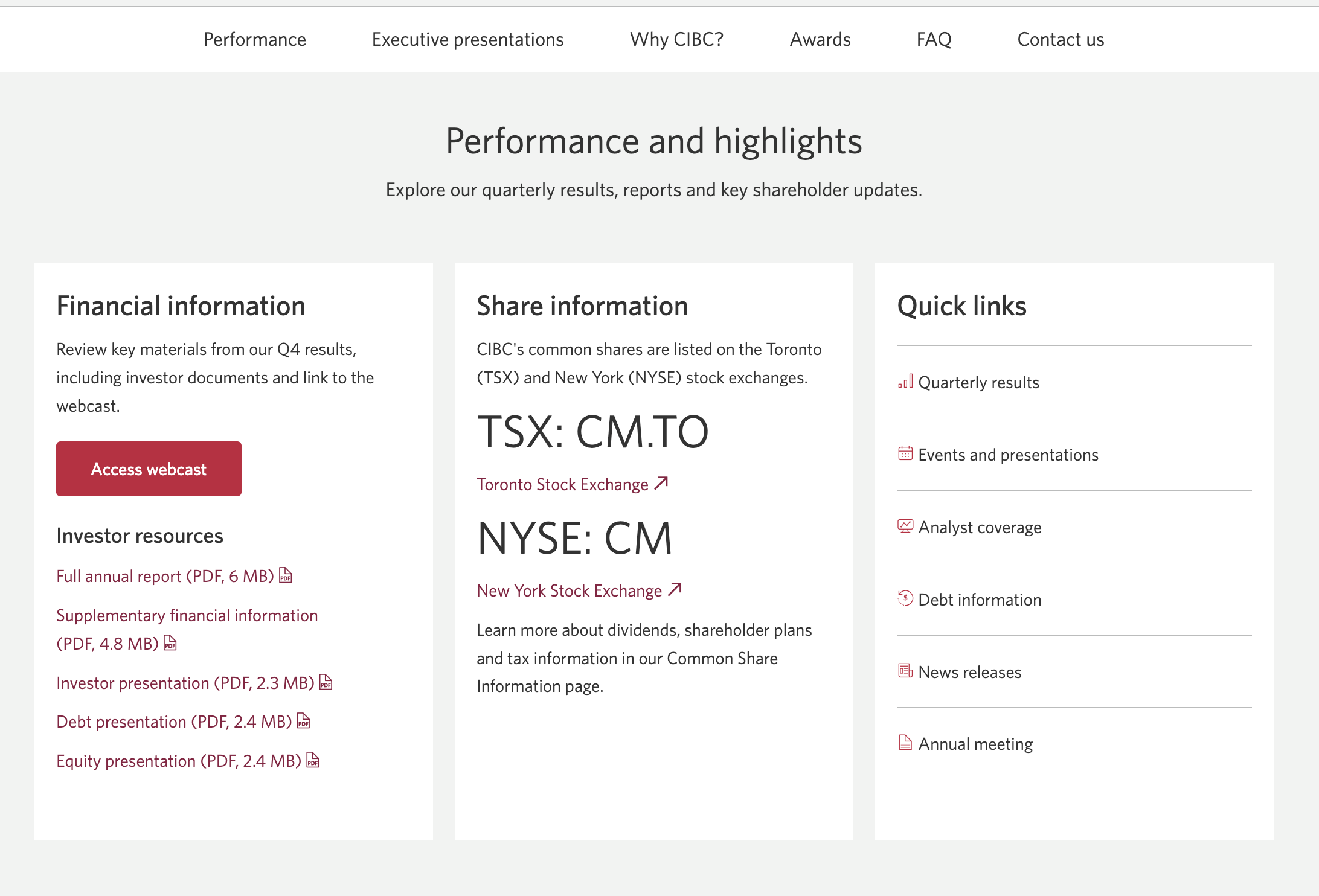
"Performance and highlights: Explore our quarterly results, reports and key shareholder updates." grouped into Financial information, Share information and Quick links
Executive presentations as cards
A long text list of events, each with Event, Speaker and Time labels, followed by year links from 2013 to 2022
"Executive presentations: Discover highlights from CIBC leaders' engagements and investor events."
Cards that lead with the date, then the event name as the headline, then the speaker
Why invest, rewritten to be skimmed
"CIBC seeks to create value for our shareholders by generating consistent and sustainable earnings while achieving strategic growth." followed by three more paragraphs
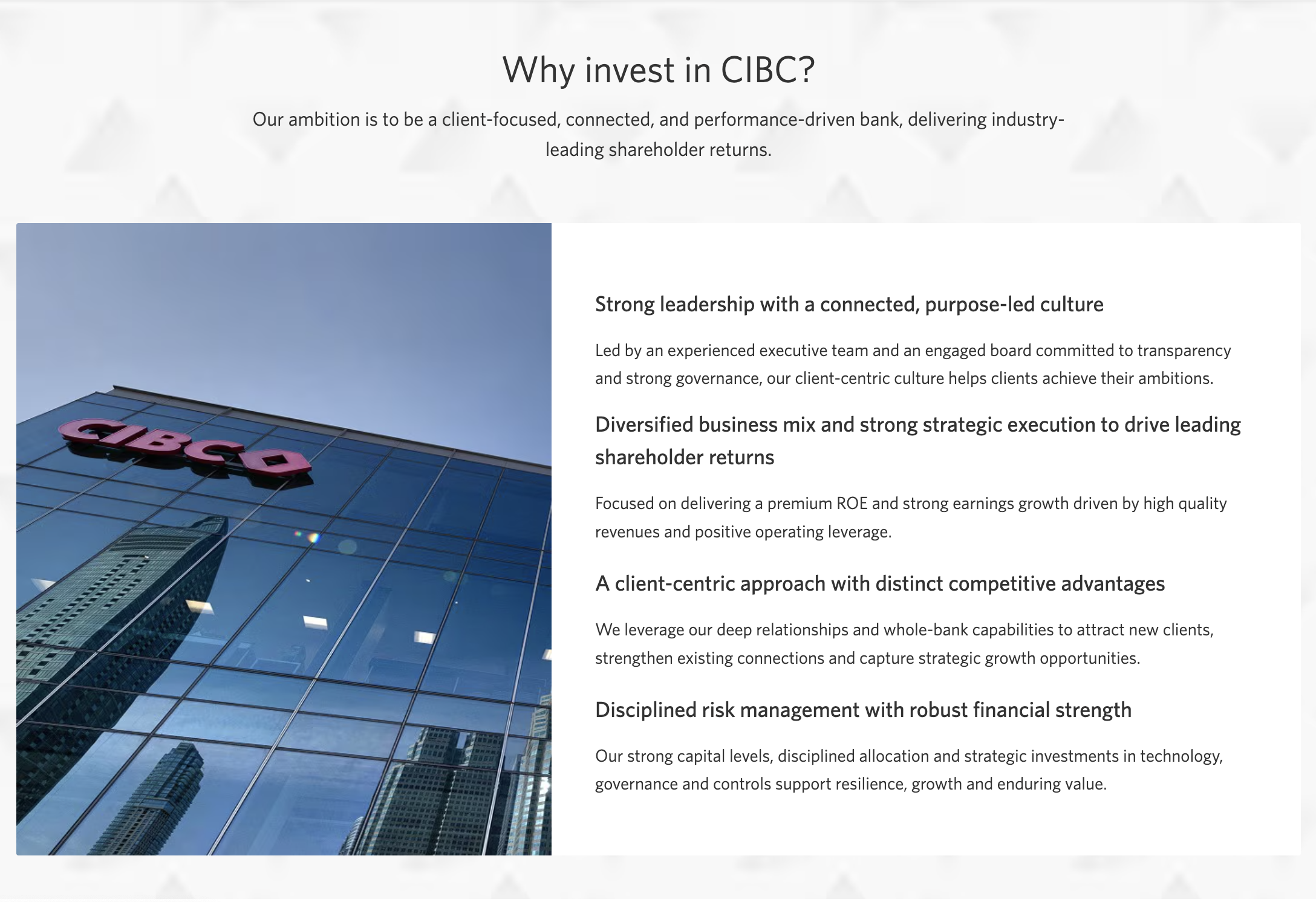
"Why invest in CIBC? Our ambition is to be a client-focused, connected, and performance-driven bank..."
"Strong leadership with a connected, purpose-led culture" · "Diversified business mix and strong strategic execution" · "A client-centric approach with distinct competitive advantages" · "Disciplined risk management with robust financial strength"
The original page
Desktop screens from the existing Investor Relations page.
The redesign
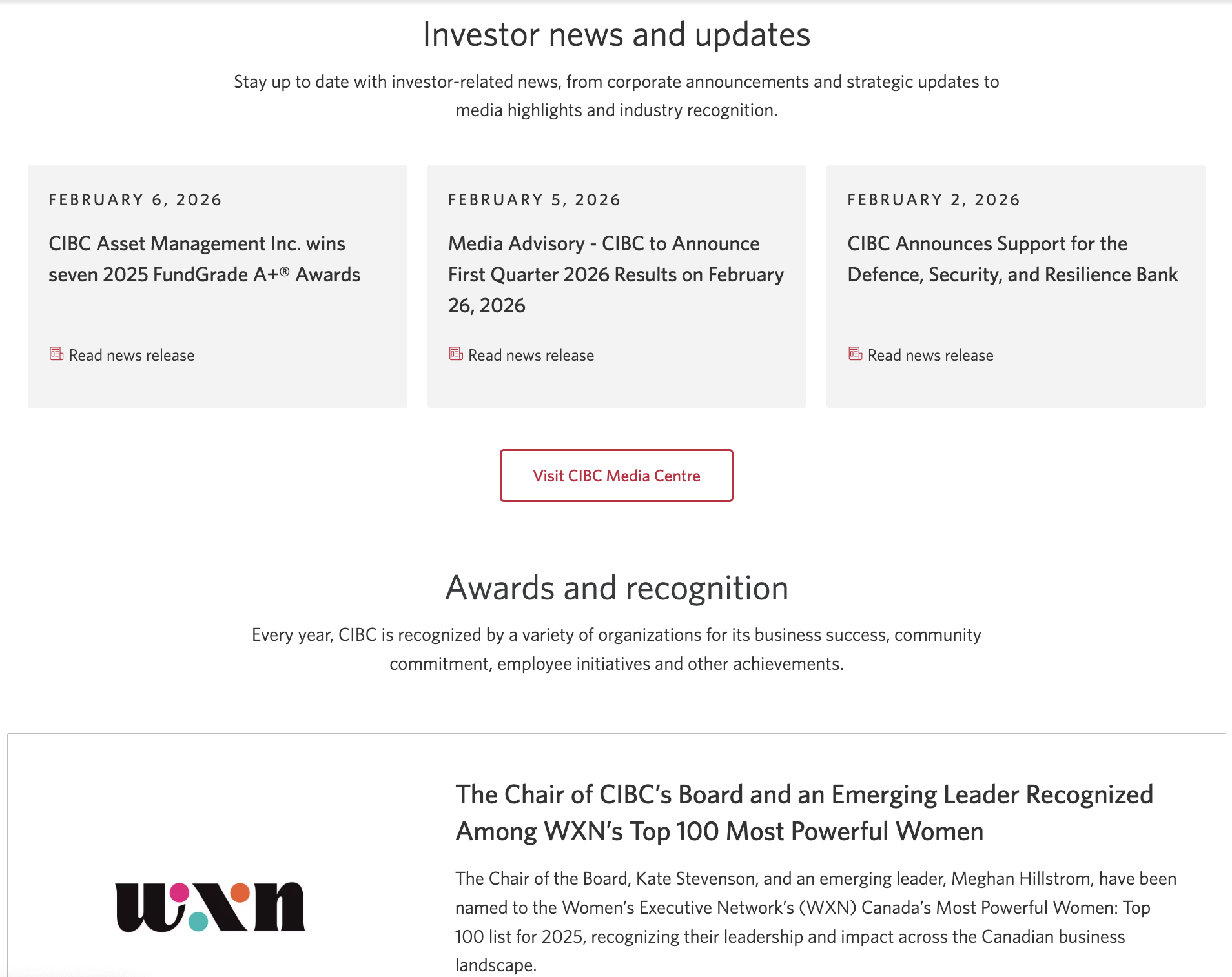
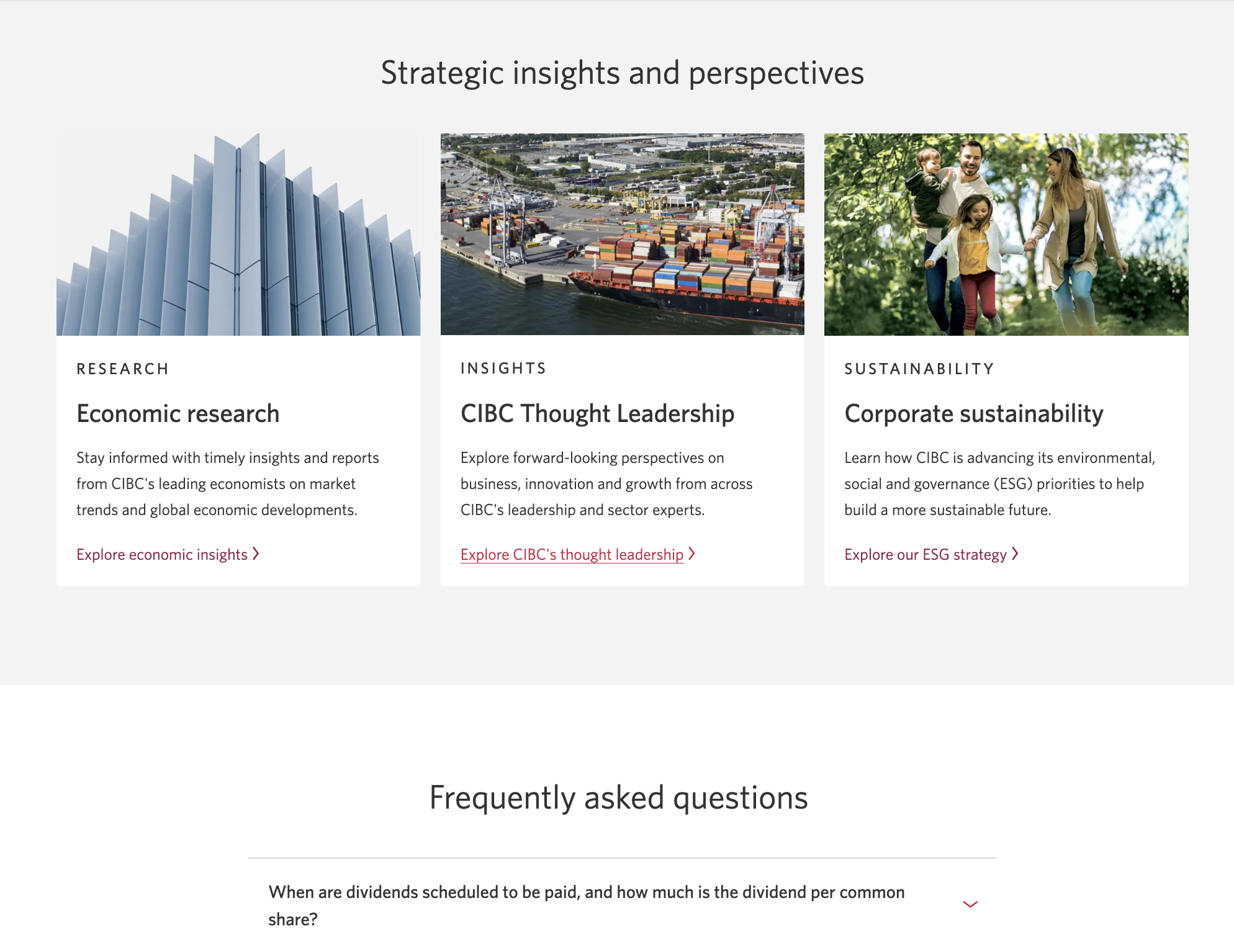
The restructured page, from the task-led entry point down to insights.
What I learned
Investor Relations pages are often treated as a filing cabinet: every document is there, so the job looks done. Structuring the page around what investors come to do, and writing each section to be skimmed, turned the same content into something people can actually use.