BMO · Lead content design
Redesigning BMO's GIC purchase flow
Buying a GIC online meant one long screen of unexplained choices. I led the content strategy and wrote the copy for a step-by-step flow that helps customers pick the right product and finish what they started.
- My role
- Lead Content Designer, the only content designer on the project
- I owned
- Content strategy for the flow, product descriptions, field labels, helper text and tips, and the voice across every step
- Worked with
- 2 UX designers and 2 developers
- Timeline
- Mar 2024 until my contract ended · Figma, Confluence, Jira
One long screen asked customers to make every GIC decision at once, in bank terminology, and many abandoned before buying.
Set a content strategy of one decision per step with guidance at the point of choice, then wrote the product descriptions, labels and tips for a five-step flow that no longer asks for details the bank already has.
A complete flow designed and handed off. My contract ended before it went into testing, so there are no results to report yet.
The challenge
A GIC is one of the simplest investments a bank offers, yet BMO's online purchase flow made it feel complicated. The goal of the redesign was to raise the completion rate: more customers who start buying a GIC should finish.
High drop-off
Many customers left the flow before completing a purchase.
Too many choices at once
Product type, term, amount, interest frequency and accounts all competed on one screen.
Built for the bank
Fields mirrored internal product data, not how customers make the decision.
Asking for what BMO already knew
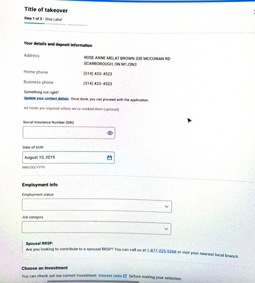
Customers start this flow signed in to online banking, yet the form asked for their Social Insurance Number, date of birth and employment details. As existing customers, BMO already had that on file.
The original flow
Customers start signed in to the BMO app or online banking, then land on one long form that asks for everything at once, including personal details the bank already has.
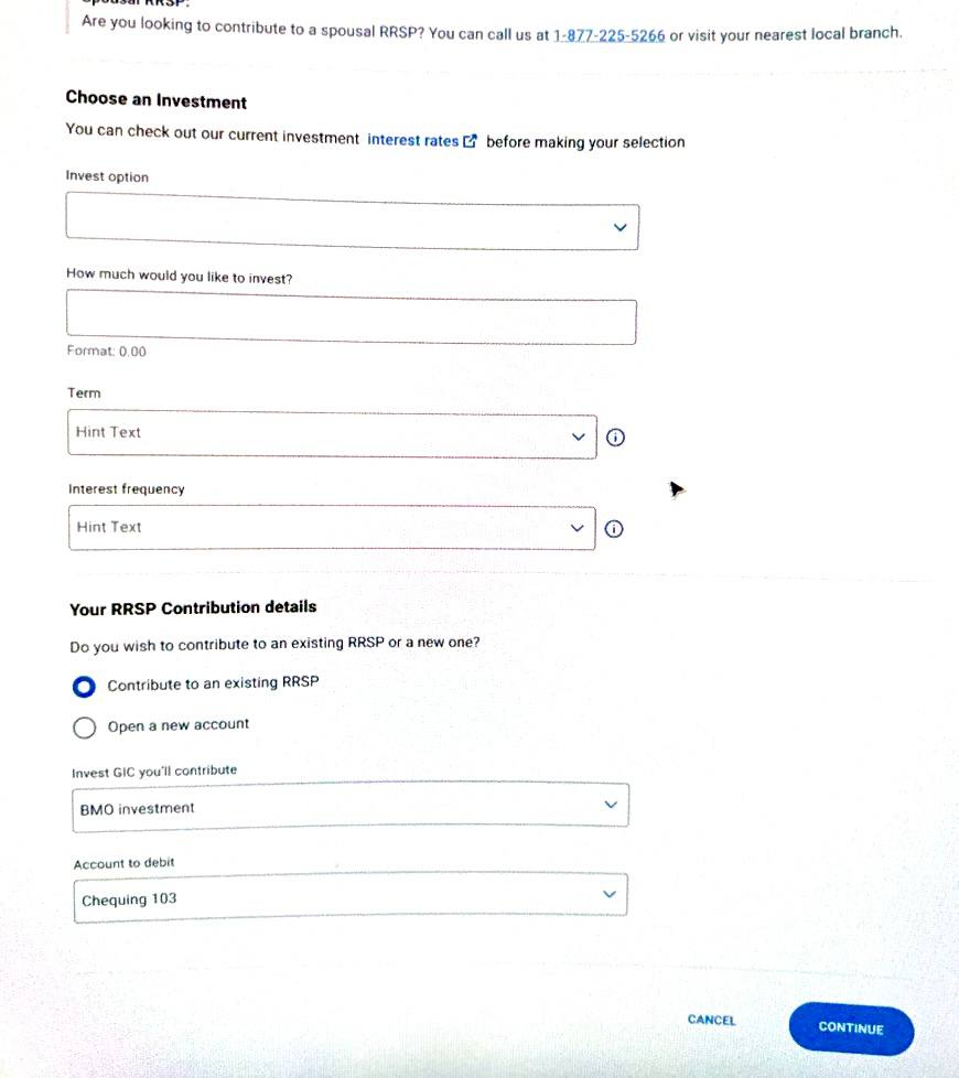
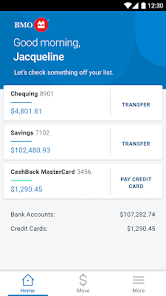

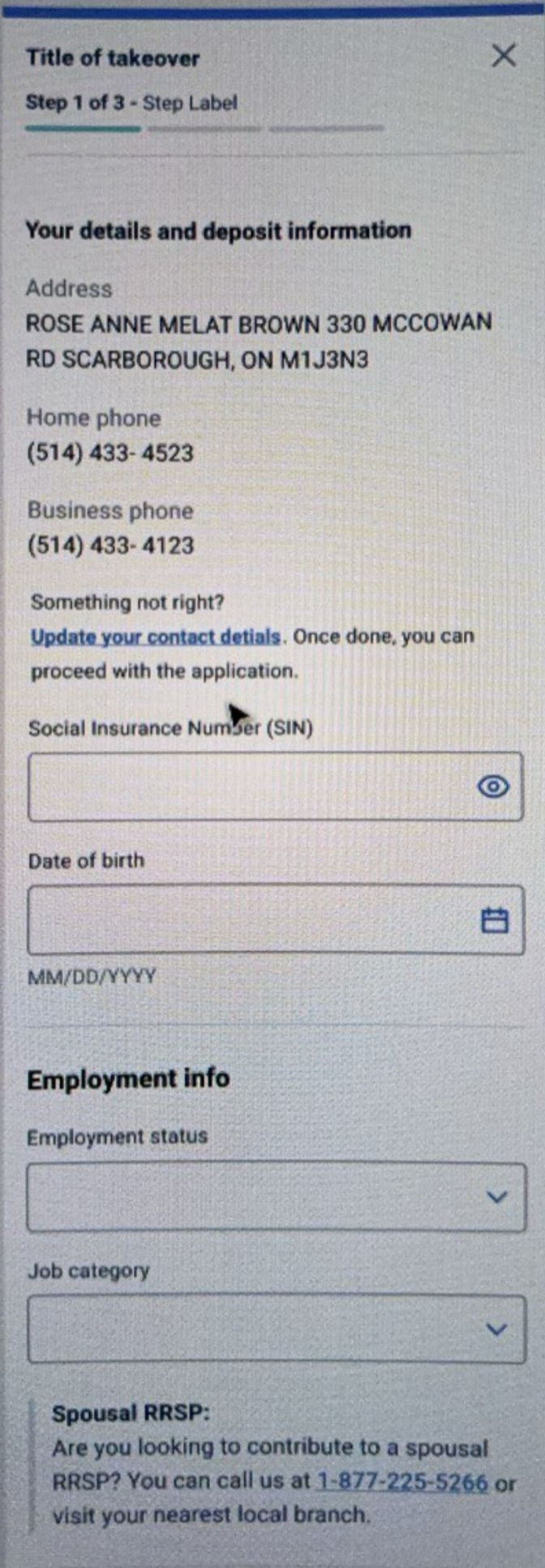
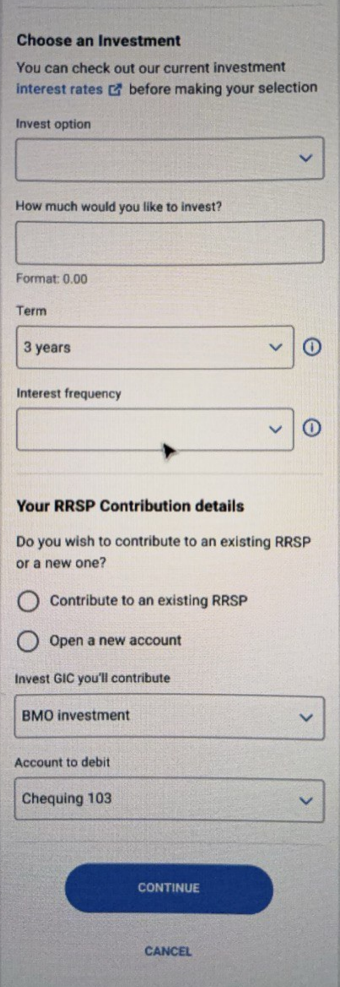
Mobile: the signed-in app home screen, then the full single-screen form and close-ups. Scroll sideways to see each screen.
What user testing showed
- Single-screen overload. Seeing every decision at once made the task feel bigger and riskier than it was.
- Missing contextual support. Terms and options appeared without explanation at the moment customers needed it.
- Over-reliance on expertise. The flow assumed customers already knew which GIC suited them.
My content strategy
Each finding became a rule for the content.
- One decision per step. Break the single screen into focused steps, each asking one clear question. (Answers single-screen overload.)
- Guide at the point of decision. Put constraints, tips and explanations next to the choice they help with, not behind a link. (Answers missing contextual support.)
- Help people choose, not just select. Describe each product by who it's for, so customers without investing expertise can self-select. (Answers over-reliance on expertise.)
- Label actions in the customer's words. Replace system field names with plain descriptions of what the customer is doing.
- Don't ask for what we already know. Signed-in customers shouldn't retype details the bank has on file.
The new flow
The single screen became five focused steps, each asking one question.
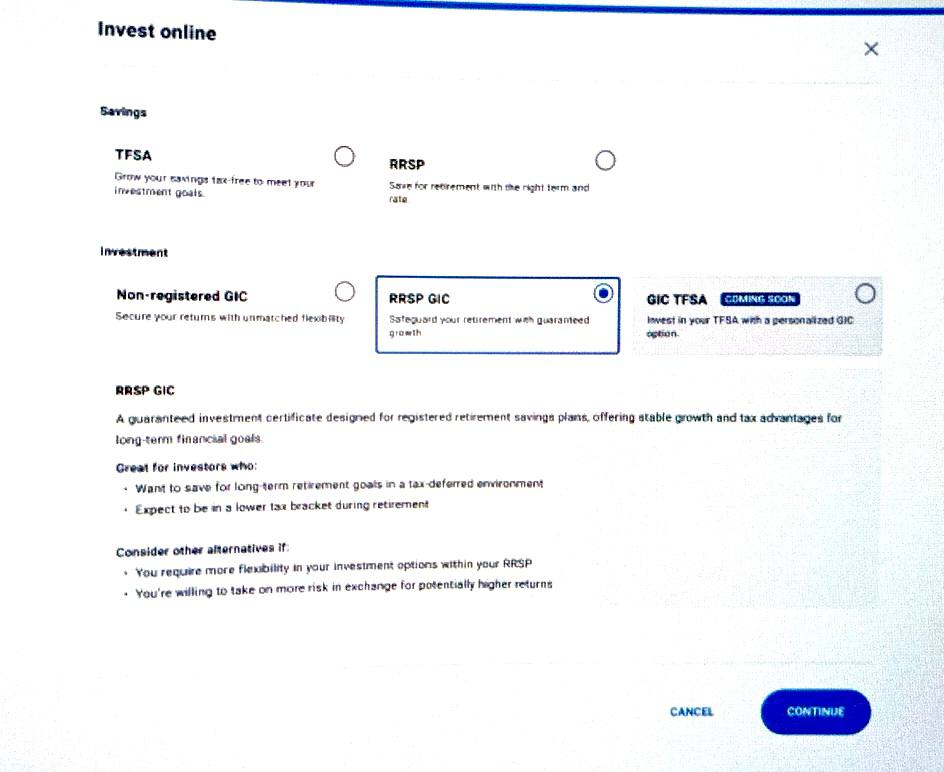
Choose an investment type
Plain-language product descriptions and "great for" guidance.
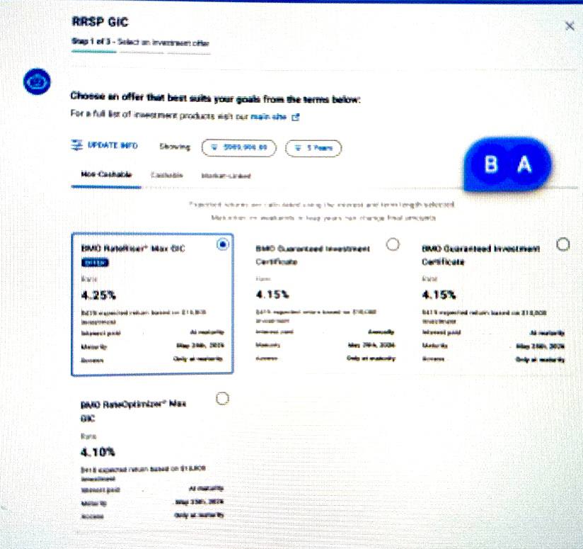
Select an offer
Terms and rates compared side by side for the chosen type.
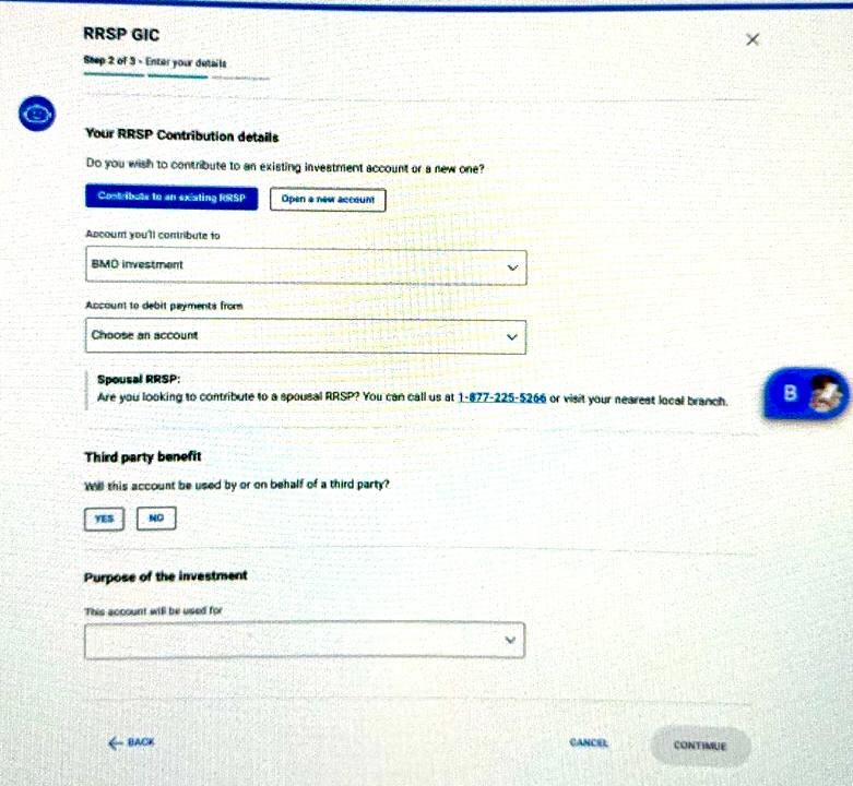
Contribution details
The amount, and the accounts it comes from and goes to.
Finalize your details
Payout and renewal options, with guidance for each.
Confirm and agree
One summary to review before committing.
The new flow on screen
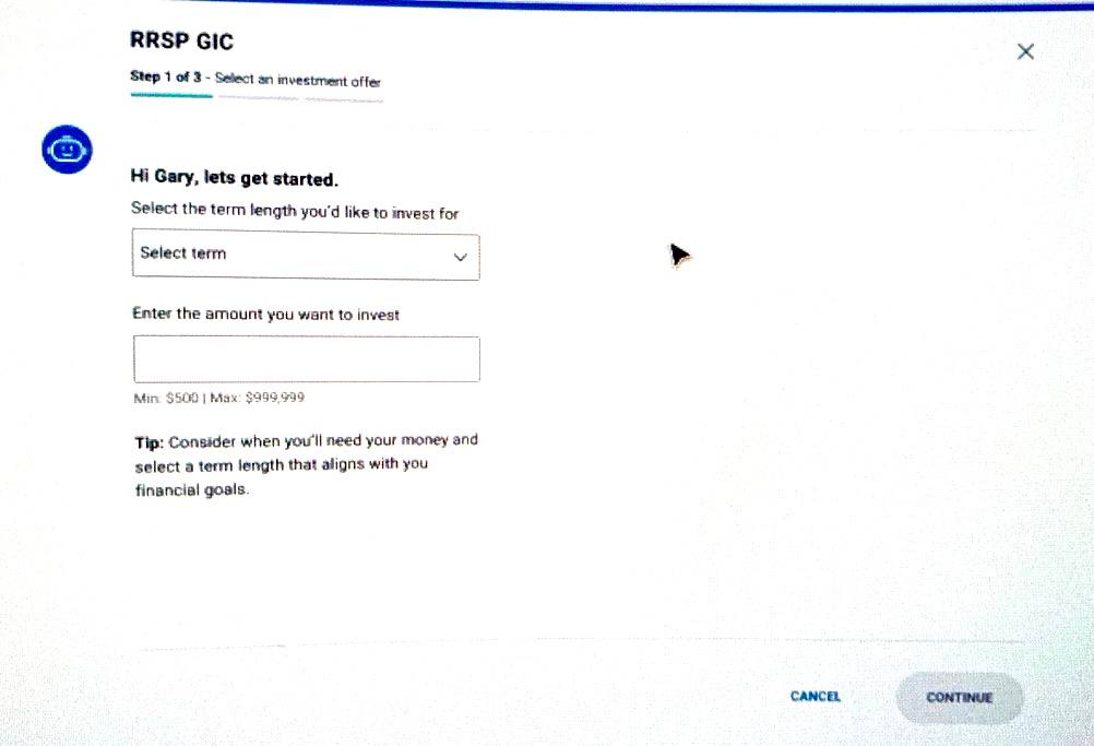
Desktop screens from the redesigned flow, from choosing a product to entering details.
From strategy to copy
How each rule showed up in the words on the screen.
Comparing offers inside the flow
Instead of sending customers to another page to check rates, the offer step asks one question and shows the options side by side, grouped by type.
"You can check out our current investment interest rates before making your selection" [link to a separate rates page]
"Choose an offer that best suits your goals from the terms below:"
Non-Cashable · Cashable · Market-Linked, with each offer's rate side by side
Setting terms and amounts with confidence
Constraints and advice now sit right under the fields, so customers don't have to guess or fix errors later.
"Term" [dropdown with an info icon]
"How much would you like to invest?" · "Format: 0.00"
"Select the term length you'd like to invest for" · "Enter the amount you want to invest" · "Min: $500 | Max: $999,999"
"Tip: Consider when you'll need your money and select a term length that aligns with your financial goals."
Product descriptions that answer "is this for me?"
The old flow offered a dropdown of product names. The new one describes each product by its benefit and by who it suits.
"Invest option" [dropdown]
"RRSP GIC: Safeguard your retirement with guaranteed growth"
"Great for investors who: want to save for long-term retirement goals in a tax-deferred environment; expect to be in a lower tax bracket during retirement"
"Consider other alternatives if: ..."
Labels that describe what you're doing
"Invest GIC you'll contribute"
"Account to debit"
"Account you'll contribute to"
"Account to debit payments from"
Removing personal details from the purchase
Every customer in this flow is already signed in, so the bank has their SIN, date of birth and employment details. Asking again added work, raised privacy worries at the worst moment, and gave people another reason to stop.
"Social Insurance Number (SIN)" · "Date of birth" · "Employment status" · "Job category"
Removed. The details step asks only about the accounts involved in the purchase, plus required questions such as spousal RRSP and third-party use.
Where it landed
The flow went from one screen with 11 fields, including personal details the bank already had, to five steps that each ask one question.
My contract ended before the new flow went into testing, so I can't share results. The bet the design makes is clear: when each step asks one question and explains itself, more customers will finish their GIC purchase. The metric to watch is completion rate from step one to confirmation.